A quick guide to understand screen sizes and screen resolutions

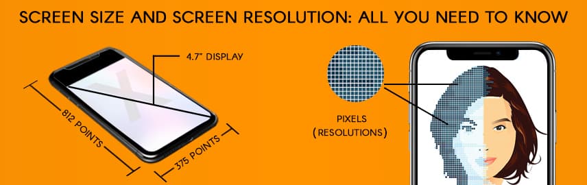
Table of Content
- What does screen size and screen resolution mean?
- Popular terms used in screen resolution and screen size
- How pixels are calculated?
- Difference between Resolution vs Dimensions
- Be familiar with different screen sizes
- Different types of screens
- Conclusion
Today, there are a plethora of smart devices for people to choose from. It can be a daunting task for mobile app developers to build the best mobile app that can give the best experience on all the devices. It is important for app developers to stay up-to-date with the current screen size and screen resolution when designing a mobile app. An app or site that is mobile optimized enhances the user experience.
There are a variety of devices on both Android and iOS of different screen sizes and pixel density. App developers need to take a lot of care to ensure the UI adapts well for each type of screen. This post provides an overview of screen size and screen resolution that help you build app for different screens.
What does screen size and screen resolution mean?
Screen size and screen resolution are the two important elements that can affect the layout of an app. There are some tools that every app designer must have — to build a user-friendly interface. Mobile devices are often rotated to show UI in portrait and landscape orientation. App designers must design for these differences.
When we buy a device, we often see two things – screen size and screen resolution. Screen size is nothing but the physical measurement of the screen in inches, while screen resolution is the number of pixels on screen. There is a stark difference between screen size and screen resolution. For example, the iPhone 15 boasts a vivid 6.1-inch screen using cutting-edge super retina XDR OLED technology, delivering an impressive resolution of 2556×1179 pixels and a pixel density of approximately 460 PPI. On the other hand, the iPhone 15 Plus takes it a step further with a spacious 6.7-inch display employing the same advanced technology, offering a resolution of 2796×1290 pixels.
Remember that screens with the same sizes may have different resolutions. When developers create mobile friendly pages, they use viewpoints, making the app viewable consistently across multiple devices.It would be impossible for app developers to design for every single device. Instead, app designers group the styling into typical sizes for tablets and smartphones. You have to work on app UI, considering particular screen sizes and pixel density. In short, it is all about controlling the visual language to suit that particular device. You need to be very clear about the dimensions, which we are going to describe here.
Popular terms used in screen resolution and screen size
Let’s proceed further with a full-fledged explanation of the popular terms used in screen resolution and screen size. The most popular terms you must know about screen resolution are as below –
- Pixels – The single color dots that refers to picture element. One can create innumerable colors and wide range of brightness by enabling and disabling pixels at different intensities. For example – you can form white screen by enabling red, green and blue at the same time.
- DPI – It also known as pixels per inch (PPI) or dots per inch (DPI) that calculates the number of pixels present in single inch of screen. The higher DPI means that the size each pixel should be small, so that it is well adjusted in that particular
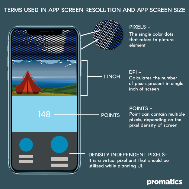
- Density independent – The unit of measurement in Android device is known as density independent pixel. It is a virtual pixel unit that should be utilized while planning UI layout to define the dimensions or position, regardless of the pixel density.
- Points – These are resolution independent measurements on the iPhone. A point can contain multiple pixels, depending on the pixel density of the screen. When designing for different types of devices, app designers should consider points, but design in pixels.
How pixels are calculated?
Screen size is usually measured in inches and is the actual size of the device’s screen measured diagonally. Anyone with a tape can measure the screen size. Screen resolution is measured by the number of pixels displayed in each dimension. In order to calculate the pixels per inch, you need to know the screen size as well as the resolution.
The formula to calculate PPI is a bit complicated. You need to take both the digits in screen resolution. Add square of both these digits and take square root of the result. The final number should be divided by the size of the screen.
For example – if the screen size is 5.8 inches and screen resolution is 1138 X 680, then PPI can be calculated as –1138X 1138 + 680 X 680 = 1757444. Square root of 1757444 is 1325.69. Now, divide the number 5.8 i.e. 1325.69/5.8 = 228.5.
Difference between Resolution vs Dimensions
Resolution and dimension are terms often used in the context of digital images and displays, but they refer to different aspects:
Resolution:
Definition: Resolution refers to the amount of detail that an image holds. It is usually described in terms of pixels (e.g., 1920×1080, 2560×1440, etc.).
Significance: Higher resolution images have more pixels, which means they can represent finer details and appear sharper.
Example: An image with a resolution of 1920×1080 has 1920 pixels in width and 1080 pixels in height.
Dimension:
Definition: Dimension simply refers to the size of an image in terms of its width and height. It’s expressed in units like inches or millimeters.
Significance: It tells you how large or small an image will be when printed or displayed physically.
Example: An image with dimensions of 8 inches by 10 inches has a width of 8 inches and a height of 10 inches.
So resolution pertains to the amount of detail, usually described in pixels whereas dimension refers to the physical size of an image, often described in inches or centimeters.
For example, you can have an image with a resolution of 3000×2000 pixels. Its dimensions can be 10 inches by 6.67 inches when printed at a resolution of 300 pixels per inch (PPI).
Be familiar with different screen sizes
Screen sizes and resolutions can vary on the same mobile platform. For example – iPhone 15 Plus has a resolution of 6.7-inch OLED display; 2796 x 1290 pixels resolution with 460 pixels per inch whereas iPhone 12 features a 6.1-inch (155 mm) display at a resolution of 2532 × 1170 pixels and a pixel density of about 460 ppi. The user interface and graphics need to be scalable, if you want the app to have a consistent look and feel on different devices. You should provide alternate bit maps to match the screen to make sure the images appear at their best on different screens.
Different types of screens
There are several different types of screens, each with its own specific characteristics and capabilities. Here are some common types:
1. HD (High Definition):
Description: HD screens offer a higher resolution than standard definition, providing clearer and more detailed images.
Variants:
- HD (720p): 1280×720 pixels.
- Full HD (1080p): 1920×1080 pixels.
- HD Ready: Often used to denote 720p resolution.
2. 4K Ultra HD:
Description: Also known as 4K, this type of screen offers four times the resolution of Full HD, resulting in incredibly sharp and detailed images.
Resolution: 3840×2160 pixels (commonly referred to as 4K UHD).
3. 8K Ultra HD:
Description: 8K takes resolution even further, offering four times the pixels of 4K. It’s capable of displaying incredibly detailed and lifelike images.
Resolution: 7680×4320 pixels.
4. OLED (Organic Light Emitting Diode):
Description: OLED screens use organic compounds that emit light when an electric current is applied. This allows for individually lit pixels, leading to deep blacks and vibrant colors.
Advantages: Excellent contrast, wide viewing angles, and fast response times.
5. LED (Light Emitting Diode):
Description: LED screens use a backlighting system composed of light-emitting diodes. They are commonly used in TVs and computer monitors.
Types:
- Direct LED: LEDs are placed behind the screen.
- Edge-lit LED: LEDs are placed around the edges of the screen.
6. LCD (Liquid Crystal Display):
Description: OLED screens use organic compounds that emit light when an electric current is applied. This allows for individually lit pixels, leading to deep blacks and vibrant colors.
Types:
- IPS (In-Plane Switching): Offers better color accuracy and wider viewing angles.
- TN (Twisted Nematic): Known for fast response times, but narrower viewing angles.
7. QLED (Quantum-dot Light Emitting Diode):
Description: QLED technology uses quantum dots to enhance the color and brightness of the display. It’s a type of LED-backlit LCD.
8. Curved Screen:
Description: Curved screens have a slightly bent shape, which is intended to provide a more immersive viewing experience and reduce glare.
9. Plasma (Less common today):
Description: Plasma displays use tiny cells containing ionized gases to produce images. They were known for deep blacks and vibrant colors, but have been largely replaced by LED/LCD and OLED technology.
Remember that the quality of a screen isn’t solely determined by its type; factors like panel technology, refresh rate, color accuracy, and HDR support also play significant roles.
Conclusion
The difference between screen size and screen resolution is important to understand for app developers to make sure to build an app that is visually compatible on any android and iOS device. If you are building an app with one screen in mind, it will spoil the user experience. Poor user experience will hurt the quality of your mobile app, which is something every app developer should avoid.
Be creative with your designs and use auto layout to craft advanced iOS animations. Make sure that the images load flawlessly no matter how the users hold their device. You should ensure that the transition between portrait and landscape is seamless. Besides these, there is a lot to do with app development such as – testing the app, images, features, design elements etc. Make sure that the app is optimized for multiple resolutions and screen sizes.
Hope this article serves as a guide and provides complete information about screen size and screen resolution so that you can deliver an optimized user experience.

Still have your concerns?
Your concerns are legit, and we know how to deal with them. Hook us up for a discussion, no strings attached, and we will show how we can add value to your operations!