11 must-have UI features of top ecommerce mobile apps
Did you know that mobile e-shopping will shoot up at whopping $163 billion sales worldwide this year? And, that estimated that 85% of mobile users will use mobile apps rather than mobile website? Well, numbers aside, the most startling fact here is although 33% of mobile sales happen via mobile app, only 10% of retailers worldwide offer mobile apps to its customers.
Considering these figures, it can only be inferred that companies serious about their business should go for a MOBILE APP NOW!
Here at Promatics, we offer some of the best, eye catchy and effective mobile apps to our customers. Creating great user experience is what we aim at and here’s how we deliver great apps for our retail friends.
Simple & Uncluttered UI:
A mobile screen is smaller than that of desktop or a laptop, hence, you’re limited to use and display content on the screen. Further, whatever content you use must be arranged in a simplified manner, ensuring the user is able to access all the features easily.
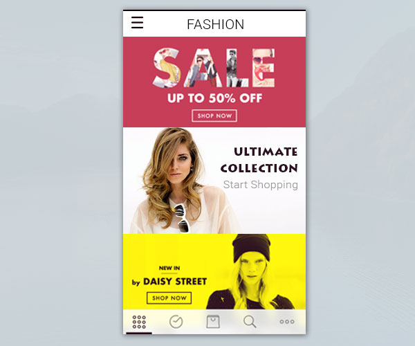
The home screen must be focused, uncluttered and should only highlight the latest products and promotions.
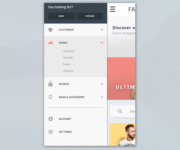
Consistent & Condensed Navigation:
To simplify user experience on a small screen, it should be ensured that the menu is positioned consistently throughout the app. The menu list should contain only the important categories or sections.
NO Long Signups or Check out processes:
A typical eCommerce user never wants to shed the sweat behind a long multi-page signup or checkout process. You can make processes easier by allowing users to signup using their preferred social networks. For check out, ask them if you can store their payment details for future purchases. This will eliminate entering data repetitively and checkout hassle free.
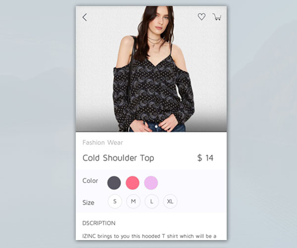
Big Images, Bigger Rate of Conversion:
Now, because our attention span is limited and we can take only that gives us visual appeal, it is suggested that your app should display less products under each category and each product should have a big, clear and appealing view.
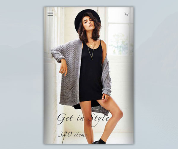
Visual Website optimizer revealed in a study that your sale is likely to increase by 10% when your images are big enough to appeal an inquisitive mind!
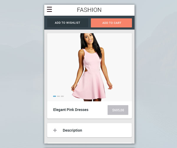
‘Add To Cart’ button:
Always remember to cut short the purchase process. If there are too many steps for checkout, you are most likely to lose your customer. Using ‘Add to Cart’ button always on your product lead your customer to purchase fast. This keeps their interest up and you get more sales!
Filters:
Fashion or style apps as well as few more ecommerce apps have two types of filters. One allowing multiple options to be selected, like in apparels where one can select types of products and prices both and other very specific. It has to be kept in mind which filter suits your business model and how to arrange the filters to boost sales.
Research shows price button is the most clicked button in any app. Adjust price button according to various categories that a product stands for sale. For example, in apparel prices may vary with size, shape and colour. Placing a filter wisely and correctly can shoot up your sales by several levels.
Progress Bar helps:
As mentioned earlier, check out process should end up early. If your customers seem to experience a longer time than expected, consider using a progress bar suggesting how many more screens they have to go before check out. This keeps them patient and helps them build better rapport with your website as well.
‘Favourites’ or ‘Wish List’:
Add a little fun and more convenient shopping experience. Allow your users to pick few products and store in ‘Wish List’ or ‘Favourites’ so that before finally buying one, they can look through and compare all the products once again. This helps them buying the best product and be happy with a convenient shopping with you!
The ‘Thumb-friendly-zone’:
With researches saying that over 70% mobile users use their right thumb to click the screen, you should always consider placing the key buttons on the right hand ‘thumb-friendly-zone’ of the screen.
The shopping cart screen:
This is perhaps the most sensitive part. If your cart isn’t reliable, your customers can abandon their goods and move ahead with another retailer. And research says, once a customer abandons selected products in a cart, they are most likely not to return in the app again.
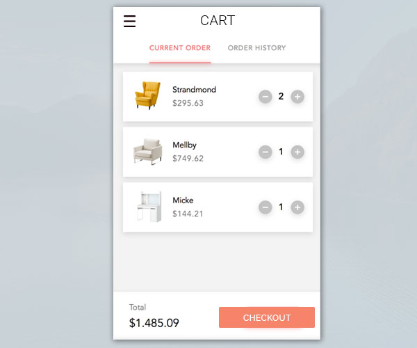
No wonder your cart must well organized, feature several payment options, display product summary, promo codes and final pricing.
Security NOT to be compromised, no matter what it takes!
Make sure that your customer’s data is secured and confidential; regardless of it blowing up your budget or giving an extra hitch to your launch schedule.
Spending a little extra time and money on security brings to you customer trust, which is simply priceless for your business!
Great apps make great businesses! If you want to be the market player in your niche, consider giving your app a face-lift. Call Promatics today! We will help you launch on a global platform!!

Still have your concerns?
Your concerns are legit, and we know how to deal with them. Hook us up for a discussion, no strings attached, and we will show how we can add value to your operations!