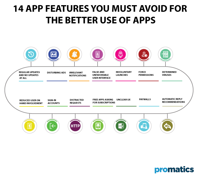
14 Features you Should Avoid in Your Apps


You always want your mobile app development process to be successful and flawless before you release a new application. However, there are some unnecessary or bothersome features that you shouldn’t include in your app because they will swiftly undermine your strategy and turn off your target audience.
Which one of them should you hold off on launching a successful application? What errors should developers watch out for when creating apps for both iOS and Android? We have a lot of experience employing both good and bad app development approaches as software development experts. In this article, we will also discuss the factors you should consider to ensure your app’s success.
1. Regular Updates And No Updates At All
Users really dislike receiving frequent reminders about app changes. Every software is updated over time, but going over the top might drastically reduce the number of mobile users. You are going on the wrong road if your application needs such upgrades every week, and the player has to wait up to several minutes for the application to download before he can use the phone again. In the opposite situation, users will feel that you aren’t paying attention to their needs and requirements if you don’t fix the issues despite numerous reports and don’t update your app. Eventually, they won’t return. Both strategies are incorrect and will cause users to want to remove your app. When thinking about updates, try to maintain the right balance and concentrate on quality rather than quantity.
2. Disturbing Ads
Given that they enable you to monetize your mobile app, advertising is generally not terrible. Most folks comprehend that. The issue arises when the adverts start to annoy customers and cause them to delete the program. Users may not like advertisements, especially when it comes to gaming apps if they offer nothing of value in return. You can continue to monetize your apps with advertising; make sure to proceed carefully and wisely.
3. Irrelevant Notifications
The User’s greatest complaint is that notifications received from the mobile app are issued every hour. They are helpful, especially for app engagement, but you shouldn’t use them over as this may cause the User and make them feel frustrated. Not usually; more is better. Next, separate the important ones from the others and make an effort to adhere to the guideline. One of the leading causes of app uninstalls is the presence of persistent, unpleasant app alerts. Here is a guide for sending appropriate and time-bound push notifications.
4. False And Unfavorable User Interface
Mandatory registering process
The user interface for the application should preferably be distinctive, straightforward, and catchy. Sometimes, when trying to make our mobile app stand out, we forget about it, and as a result, the audience finds the interface difficult to read, distracting, or irritating.
Have you ever removed items from your shopping basket because you had to register first? Sometimes individuals go mad because there is no choice for a one-time purchase. They want to buy things as quickly and easily as possible without having to open another pointless account. Customers are deterred from taking further action and returning if they cannot use the application or finish the purchasing process as a guest.
Burdened Information
Understanding how the human brain functions and how information is absorbed and processed is extremely helpful in the role of a UX/UI designer. In this work, having a fundamental understanding of psychological mechanisms is crucial. Miller’s Law states that we have a working memory capacity of between 5 and 9 things, usually around 7.
Too much information, including copy, visuals, animations, and other components, causes people’s brains to become overwhelmed, distracted, and confused. Making the interface as user-friendly as feasible and reducing the likelihood of such outcomes is the best method to adhere to those restrictions. How do you do it? Ensure you provide the ideal quantity of information on a website or mobile app’s screen. It shouldn’t be causing overload, but it should be sufficient to make it significant.
Unintelligible Copy
The issue—too much information—is quite similar to the prior point. As specialists in a specific field, we occasionally tend to employ words common in our business but may be too technical for users. They see it doubling the amount of detailed information that needs to be unpacked before it can be processed and applied. Forming deceptive directives is the second part of the unclear copy.
5. Involuntary Launches
Some applications annoy users because they turn on automatically when the phone or computer starts up. Features like this in your app can be very distracting, time-consuming, and drain your battery, which can greatly reduce your chances of success.
6. Force Permissions
Minimize the permissions your app needs to run. People care more about what they store on their devices and protecting their data. Apps that weirdly want to access information unrelated to functionality are often removed before first testing.
7. Determined Viruses
So if your app starts too slowly or freezes frequently, it may not last long on users’ phones. Similarly, apps that consume a lot of phone storage or battery will prompt users to uninstall the app.
8. Reduced User On hand Involvement
You only have one first impression. Whether a user stays longer or eventually deletes an application is often the defining moment. If the onboarding process is too long and time-consuming, the text is confusing, and the next steps aren’t clear, the User will have a bad experience.
You may exit the app and never come back. A good onboarding process should be quality, fast, and convey a clear message. It should also indicate the purpose of your app and demonstrate the value it provides to users.
9. Sign-In Accounts
If possible, allow the app to be used without first signing into an account. For example, downloading the Amazon app will enable you to browse products without logging in. However, if the User must be logged in first, provide an option to keep the User logged in without having to log in each time the application is opened.
10. Distracted Requests
Users can get frustrated when they are asked to follow your company on Twitter or repeatedly asked to like you on Facebook. Similarly, asking users to leave positive reviews of your app can help drive downloads. But if you push the envelope too far, you can lose customers.
Some apps even force users to rate the app before continuing to use it. Random “rate this app” or “follow us” requests can be annoying for users.
For example, Uber asks for a rating when a user successfully completes a ride. Alternatively, the game app can discreetly rate or send requests when the User unlocks a new level. There are best practices for asking for reviews and ratings to help increase traction for your mobile app.
11. Free Apps Asking For Subscriptions
It was free when users downloaded the app, but all app features were paid for. Too many in-app purchases that aren’t worth enough in a free app can be harmful. Users may be willing to pay extra for premium service, but expect the app’s basic functionality to work without a purchase.
Mobile app developers should not be too greedy to mislead users by making their apps available for free and then doubling down on in-app purchases. Greed is not always good, and certainly not in this context.
12. Unclear UX
Some mobile app developers, taking apps like Tinder and Snapchat as examples, introduce left or right swipe elements assuming the User knows how to do it. Well, no – not all of your audience will be Tinder users. You can improve this by introducing responsive UX elements and clarifying what your app should do.
These practices make the User experience smoother and more intuitive. Many developers want to follow in the footsteps of Snapchat and Tinder’s UX by adding swipe elements to their apps. However, it’s important not to assume that your customers know they can swipe left or right. You can add responsive UX elements that clarify what your app can do.
13. Paywalls
Many new apps understand that customers don’t want to see ads, so they make money by encouraging users to choose premium tools and services here and there. The problem with some in-app purchases is that they are usually for non-essential devices. Users get very uncertain whenever an app asks for money to “unlock” features that come standard with the desktop version.
14. Automatic Reply Recommendations
Users don’t like many of the auto-suggested answers the phone asks them to choose from. For example, many of the suggested solutions are too casual for business use, and the options are too easy. It can lead to accidental clicks; in general experience, replies are often accidentally selected and sent in messages.
How To Prevent Useless App Features?
We know that developing a successful app is not easy and takes a lot of work and time, but there are some tips to avoid these common mistakes.
Make A List And Act Accordingly
First, it’s a good idea to create a list of required features for your app in order to provide value to users who download your app from the App Store. For each role, make a list of key questions, such as:
a.) Does it solve end-user problems?
b.) What value does it provide them?
c.) What does it take to develop this feature?
Instead, it’s best to ask the recipient directly what features they need, which features they want to use, which features they need, and which they don’t want. Then organize them by priority. The more value it brings to the User, the more important it becomes.
Apply Design Strategy
Strategy plays an important, if not important, role in the success and outcome of goals and plans. It applies to business, life, career, and basic military training. To reduce the risk of users uninstalling your app, review and follow common mobile app design strategy tips:
i.) Make your app accessible on all screen sizes
ii.) Provide simple, descriptive descriptions, text, and images
iii.) Use a clear call to action (CTA)
iv.) Avoid features that confuse users
Conclusion
The iPhone and Android operating systems have significantly impacted the large mobile industry, especially mobile app development and implementation. The better the app is designed and built, the better the features used, and the more robust, intuitive, and user-friendly the app will be. To avoid any inconvenience for the mobile app users, you must ensure to prevent the usage of useless app features.
Mobile app excellence meets customer and end-user needs. This article’s top 14 useless mobile app features show how important it is to select useless app features and services to develop apps that benefit your business. Avoid these features on the iPhone and Android platforms to create the best, most intuitive and fastest apps.

Still have your concerns?
Your concerns are legit, and we know how to deal with them. Hook us up for a discussion, no strings attached, and we will show how we can add value to your operations!