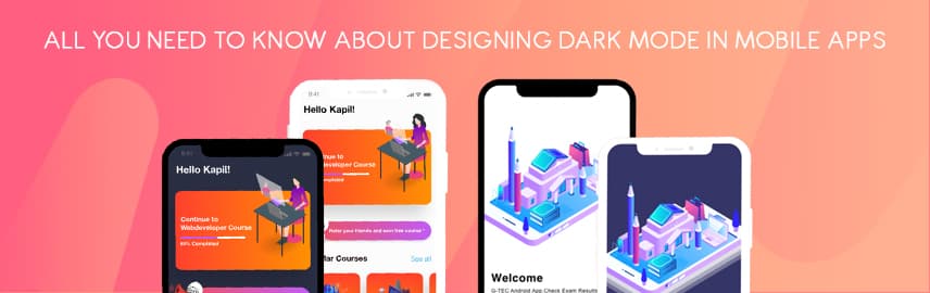
Dark Mode for Apps: What’s the Fuss About?

Given the widespread usage of mobile phone devices and increased reliance on apps to execute many days-to-day functions, users may have to open an app in pitch dark ambience. Very often, the light that the app emits in pitch dark is too high and almost piercing for a user’ eyes. There have been reports that indicate that prolonged use of such apps results in dry and itchy eyes for users. Thus, dark mode for apps offers relief from such troubles by making it relaxing for users’ eyes to work on apps in the dark. Moreover, dark mode in mobile apps helps in prolonging the battery life of phone devices.
Further, you don’t need a mobile app design expert to tell you that only an app that follows the latest market trends becomes a hit with the users. Dark UI is a recent addition to app development trends all set to be a game-changer for mobile app businesses.
Right Way to Dark Mode for Mobile Apps
Creating a successful dark mode experience in mobile apps is not as simple as reusing colours or inverting shades. If an app user is subjected to reading white text on a black background, there are chances that their iris would open more to receive more light. Additionally, the deformation of the lens would create a much fuzzier focus at the eye known as Halation. This is why an unhealthy dark mode can be pretty harsh on a user’s visual health due to high contrast and strain that originated from it.
It’s relatively simple to conclude that dark modes aren’t just a pure composition white on black. Since dark modes are supposed to be consumed at night, a pitch dark background with bright white text can make it extremely hard to use.
Dark Mode Designing for Android Apps
The parent company Google has come up with extensive documentation support to help app designers get started with understanding how dark theme operates for the Android ecosystem. Google has laid out principles that define the dark UI design and give developers an insight into how to design dark mode.
a.) Dark with Grey
Opting for grey colour instead of solid black for showing space and elevation in an environment with a wide depth range in the dark theme is recommended.
b.) Colour with Accents
Google recommends using a limited number of colour accents in dark theme UIs. This leaves the majority of space for dark surfaces.
c.) Save Energy
For developing dark mode in devices with OLED screens or that require efficiency, the focus needs to be on conserving the battery life by reducing the use of light pixels.
d.) Enhance Accessibility
Also, app developers need to accommodate the regular dark theme users such as users with low vision, by meeting accessibility colour contrast standards.
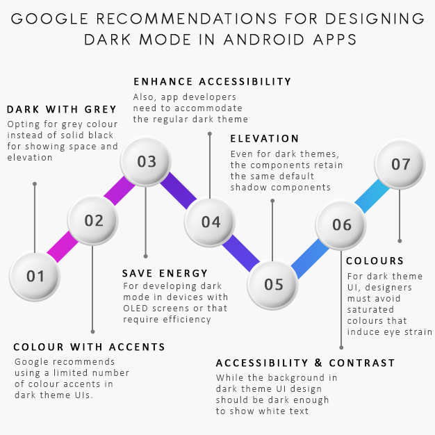
e.) Elevation
Even for dark themes, the components retain the same default shadow components and elevation levels as in case of the light theme. The only difference is the illumination of the surface of elevation levels, i.e. higher the surface elevation; the lighter would be the surface. Additionally, the lightness is portrayed through a semi-transparent overlays’ application.
f.) Accessibility & Contrast
While the background in dark theme UI design should be dark enough to show white text, developers must settle for a contrast of a minimum of 15.8:1 between the background and text. This is how the body text passes the WCAG’s AA standard of 4.5:5:1 when added to surfaces at the highest elevation on the app.
g.) Colours
For dark theme UI, designers must avoid saturated colours that induce eye strain. Instead, designers must pick desaturated colours which increase legibility.
Dark Mode Designing for iOS Apps
Apple prides itself in being a premier in the field of dark mode and with it has re-invented the meaning of UI styling and colours in iOS. Here are chief considerations that define the dark UI design and give developers an insight into how to design dark mode for iOS apps.
a.) Semantic Colors
Apple has introduced semantic colours for the commonly applied UI elements, for standardizing the look and feel of the iOS apps in both dark and light mode. While these colours do not come with an absolute RGB value, they quickly adapt to the iOS interface style. The semantic colour options also facilitate handling the text and overlay colour in the dark mode.
b.) System Colors
Further, the tech giant has also come up with nine predefined system colours which are dynamic by nature and supportive of dark system-wide appearance. They too adapt to selected interface styles.
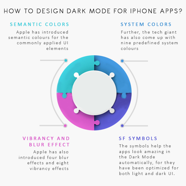
c.) Vibrancy and Blur Effect
Apple has also introduced four blur effects and eight vibrancy effects, which automatically and flawlessly adapt to the iOS interface style. Additionally, Apple has also added 4 vibrancy effects in iOS dark mode typography suite, 3 in overlay and 1 for the separator.
d.) SF Symbols
The Human Interface Guidelines laid out by Apple offer a collection of more than 1500 symbols for developers and designers to use in the applications they develop. The symbols help the apps look amazing in the Dark Mode automatically, for they have been optimized for both light and dark UI.
Things to Keep in Mind When Designing the Dark Mode for Apps
Both Apple and Google have made it their imperative to provide users with a good UI experience. This is what they intend to do with their dark mode design principles. Consequently, not giving the dark mode design theme its due credit can do more harm than good. Very often, businesses find it challenging to integrate dark mode into their mobile app in a scalable way without losing the product’s soul. In order to design a compact, maintainable dark mode for apps that allows the existing features to feel renewed is often a challenge that mobile app development teams struggle with. Here are certain things to keep in mind when designing the dark mode for mobile apps:
I. Stick to Core Product Identity
It’s essential to retain the app’s core product identity while developing the dark mode for it. The purpose that app serves for its users should be well executed in all sorts of environments, and it is the job of app developers to preserve those functions even in the dark mode. Further, the implementation of dark mode must also maintain the brand identity in the app appearance. App developers must balance functionality, usability, and quality when they design the dark mode for their apps.
II. The Use of Colour is the Game of Balance
It is a fact that in the dark mode, the difference between the saturated and unsaturated colours stands out distinctly. Thus, maintaining a strict balance between distinction and accessibility is the key when designing for dark mode of mobile apps. It’s best if the app developers begin with auditing the most-used parts of the app experience in light mode. It’s equally important to identify elements present at different elevations, such as action sheets and dialogues as this helps in defining most of the elements being used throughout the app.
Further, it would also help the development team isolate the remaining gaps. Next, developers must consider examining saturated colour usage to meet WCAG contrast ratio standards across both light and dark modes. Businesses that support high contrast accessibility feature in their colour choices make it easier to see text and UI elements for users.
III. Semantic System can End the Chaos
A semantic system can help app developers create a single colour swatch that has two or more colour values. Further, these colours can change depending on if the app is in light or dark mode. When app developers use a semantics system, they can assign two fills to one component, making things easier, faster, and easily maintainable. The system allows businesses to assign multiple colours to a single swatch, making them easily alterable between light and dark mode.
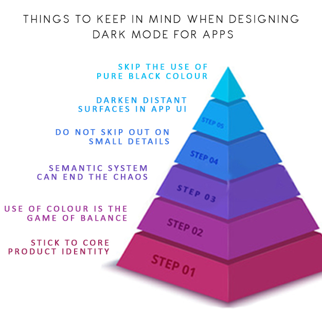
IV. Do Not Skip Out on Small Details
Small details like icons and images are meant to communicate the purpose for what they are created. Further, elements like Icons need to maintain their form. Even for Images, the smallest details like app onboarding screens or supporting tutorials, need to be updated to support the dark mode.
V. Darken Distant Surfaces in App UI
When it comes to dark mode, background colours for UI elements follow one chief guiding principle, i.e. the closer the layer is to the user, the lighter the surface area. This particular tandem holds in an environment where a light source is cast from above. Consequently, the further behind a layer is, the less light it receives and the more it sets back into the background. Very often, app developers are tempted to invert an existing light theme to launch it into the dark mode. But this can lead the distant surfaces to become light and near surfaces to grow dark, which breaks physicality and feels immensely unnatural. It is best to take only the primary surface colour of a light theme and invert it to produce the primary surface colour of the dark item.
VI. Skip the Use of Pure Black Colour
A dark theme is not as simple as using white text on a black background in mobile apps. App design like that would make it difficult for users to look into a high contrast screen. For incorporating dark mode into a mobile app, it is best to use dark grey as the primary colour for the dark mode components. This can significantly lower the eye strain and make it easier to look at shadows when compared to black.
Conclusion
Although Dark themes come with many benefits and full acceptance, they remain challenging to execute. It is not as simple as reusing colours and inverting shades as it increases eye strain and makes it harder to read in low light. Further, it may even result in a deterrence of visual and information hierarchy on the app.
We at Promatics, realize the importance of the dark mode in mobile app design. The way it prevents instances of tiring and drying of eyes with prolonged mobile phone usage, it is a unique element for apps today. While both Apple and Google offer detailed documentation explaining the process of designing a dark theme application, we keep in mind certain important aspects too. For example, we make it a point to avoid a solid black colour, keep the emotional aspect of using black colour in mind, look at the transitional difference between white and dark mode app design. Through experience, we have learnt that non-strategically implemented dark mode can do more harm than good in the form of hazing effect.
We know that designing the dark mode version of your app can take a lot of time but rest assured that it is worth it. We hope our insights will help fellow young app developers nail the dark mode for mobile apps. If you are a business looking to incorporate dark mode into your app design, we are just a mail/comment away.

Still have your concerns?
Your concerns are legit, and we know how to deal with them. Hook us up for a discussion, no strings attached, and we will show how we can add value to your operations!