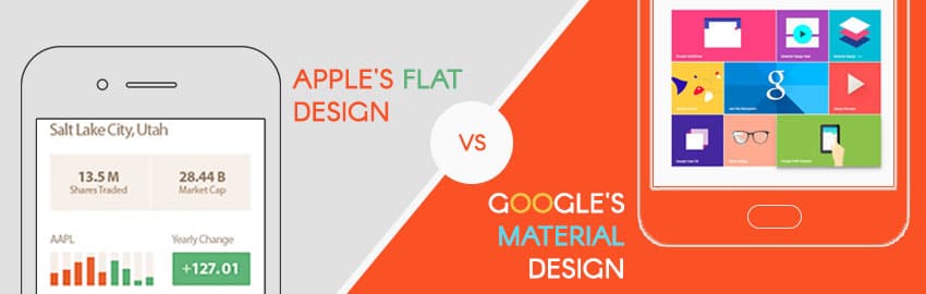
Google’s Material Design vs Apple’s Flat Design: Which is better?

Since the release of Google’s material design, there is an on-going debate over – material design vs flat design: which is the best? If you ask a few designers, you will probably get different answers.
User interface design has been influenced by a number of trends in the recent years. In this post, we are going to have a debate over which is the best UI design. After reading this post, you will get answers to questions like – which is the best mobile design right now? Is it a good idea to move from flat design to material design or vice-versa? What is so great about both the designs? And so on………
Before we go into detail about both these UI designs, let’s know what is material design and flat design.
Apple’s Flat Design
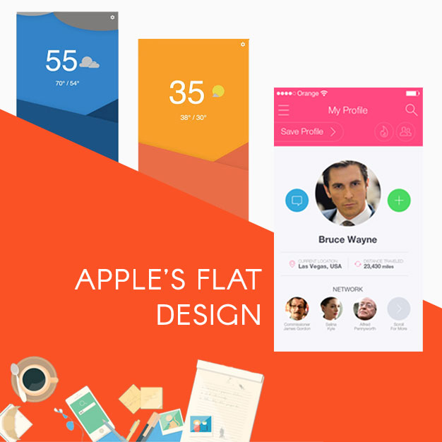
Flat icons are uninitiated and use simple images to deliver your message quickly, compared to detailed illustrations. The user’s attention is directed towards valuable content, as people are less likely to examine the digital art, rather than reading the content. These flat images may look nice to decorate the webpage and help the users navigate through the page easily.
Flat design is free from multi dimensional elements and makes feel like all the objects are laying on a single surface. Though flat elements may look stylish in terms of resolution, they cause some issues in the beginning.
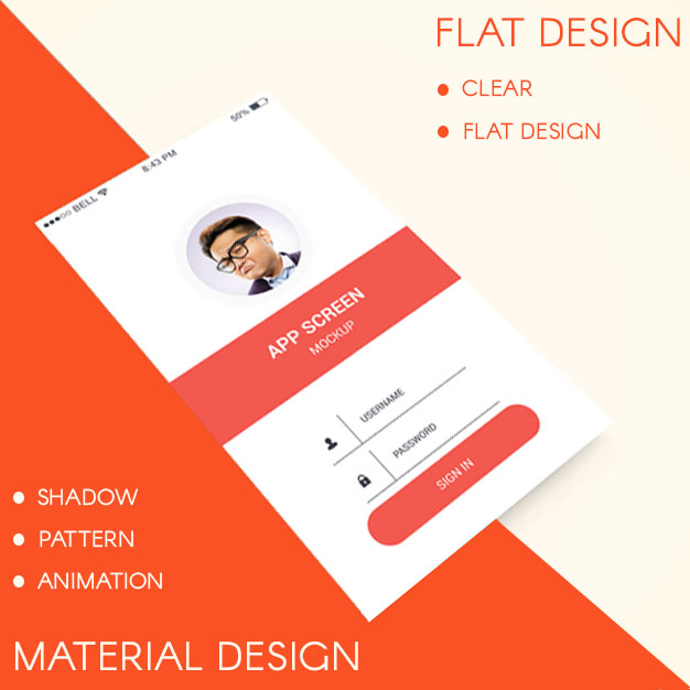
Flat design does not have any stylistic elements such as – gradients, textures and shadows etc are just like play of fonts, colors and icons. However, due to the absence of gradients, textures, shadows etc, the flat design elements may look much smaller, which eventually speedup the page load time. This is where we need material design.
Google’s Material Design
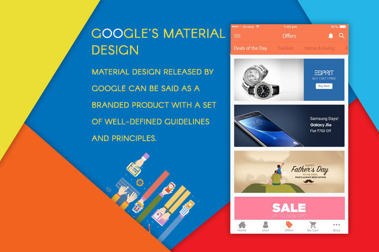
Material design released by Google can be said as a branded product with a set of well-defined guidelines and principles. Every mobile app designer should stick to these ground rules to make things look same on all the android devices. The main idea behind introducing this design seems rather obvious. Flat design is a less intuitive design and users get mixed up due to excessive flatness of objects. In flat design, clickable elements get usually confused with non-clickable icons and texts.
To overcome this problem, material design tries to introduce some skeuomorphism in the most simplified design. Though material design looks flat, it stays multi-dimensional. In short, material design is an improved version of flat design which lays stress on the minor details in terms of animations, shades and layers. Material design makes the product feel more intuitive when it comes to navigation and yet maintain its simplicity.
The best thing about material design is that it gives the designers a complete design language to create apps that look and feel the same across different platforms. The guidelines of material design area whole way of perceiving different elements that exist in digital space.
Flat design Vs material design
It is important to understand that Google and Apple are similar competitors with their standard features and user expectations. Failing to understand the difference between both these designs is likely to result in an undesirable user experience. Google release the material design a few years ago and has become a standard for Android app design. Unlike Google material design, the flat design released by Apple doesn’t have an official name. It focuses more on clarity and depth, as a result of which more vibrant colors are used. The main difference is in terms of depth, animation, clarity and navigation.
Depth of flat vs material design
The way how objects move in space and interact with each other depends on light, surface ad movement. When it comes to interaction with applications and devices, both Google and Apple have different opinions. According to Apple – mobile devices are seen as window into another world, embracing infinite depth in their applications. On the contrary, Google believes that humans should interact with the components as if they were stacked over each other. The users should feel as if they are holding the screen on palm of their hand.
Animation, pattern and shadow
Google considers animation is something that enhances the user experience and gives life to other components. Material design uses different types of animations to express the type of material to interact with. The animation would appear as if you are arranging cards on a piece of paper. If you want to refresh the Google page, it would bounce back. This is the key concept of material design.
On the contrary, Apple believes that animation should be in such a way that it takes the user to the destination without distracting the user from actual content. Google tends to lean on human side, while Apple tends to lean on inorganic side.
Clarity
Clarity can be platform specific and depends on what you are familiar with. What is clear for Apple and Google users depends on what they are familiar with. Android users may not recognize iOS icon instantly. Apple promotes gradients and blurred design, while Google gives importance to drop shadows. Both the platforms replicate in real life in different ways. The center principle is simplicity to achieve perfect results.
Navigation
Navigation is one of the must-have features when it comes to a better UI. The structure of your app should be organized according to the contents and tasks the user want to see. Google has a fewer rules for navigation and it gives a great level of flexibility for the designers. The navigation can be in many different places, and should be obvious. According to Google navigation rules, a variety of action buttons and components can be used that reveal different options.
On the contrary, Apple uses a different navigation system that is easy to understand and use. The idea is to have an app with less than 5 functions that force designers to think about the features of their app. When it comes to features of UI, Google and Apple think differently.
When it comes to applications, both the companies have an extensive belief system. Google’s material standards tend to lean on human side of design; while Apple tends to have the users go straight into the facts. Both the companies believe in creating a tactile OS experience that makes the user feel like holding the screen in hand. No doubt, Google and Apple are unique in the arena of user interface design and have their own opinions when it comes to UI design.
Wrap up!
Google’s material design and Apple’s flat design are trendy and have their own features. It is actually a stupid thing to debate over the advantages and disadvantages of both these platforms. Material design was just a response to radical flat approach. Flat design was evolved considerably over years, and is not flat already. Learning from its own mistakes, it is currently using layers and faint shadows to make objects feel deeper than before.
To create a really great design, nothing hinders you from combining these two. Flat design is a closed group that depends on user’s familiarity with the design, while material design tries to get some ideas from flat design — but is optimized for digital. It reminds of the real world to make the interface intuitive.
What do you think about which one is better? Feel free to leave your comments below!

Still have your concerns?
Your concerns are legit, and we know how to deal with them. Hook us up for a discussion, no strings attached, and we will show how we can add value to your operations!