10 simple tips to improve app retention rates

In today’s digital world, companies need to invest in improving the user experience or UX result. With advantages of lower support cost, lower cost of customer acquisition, better return of interest and best of all increased market share and higher customer retention, many enterprises find the absolute need to have the great user experience.
With Apps taking over from the web-based or offline applications, great UI and UX is required even for Apps. For many apps, a solid design along with the meeting the customer expectations turns out to be the differentiator.
We have put together ten of the best tips that could increase not only address some of the usability issues but also help in improving the overall design of the
app.
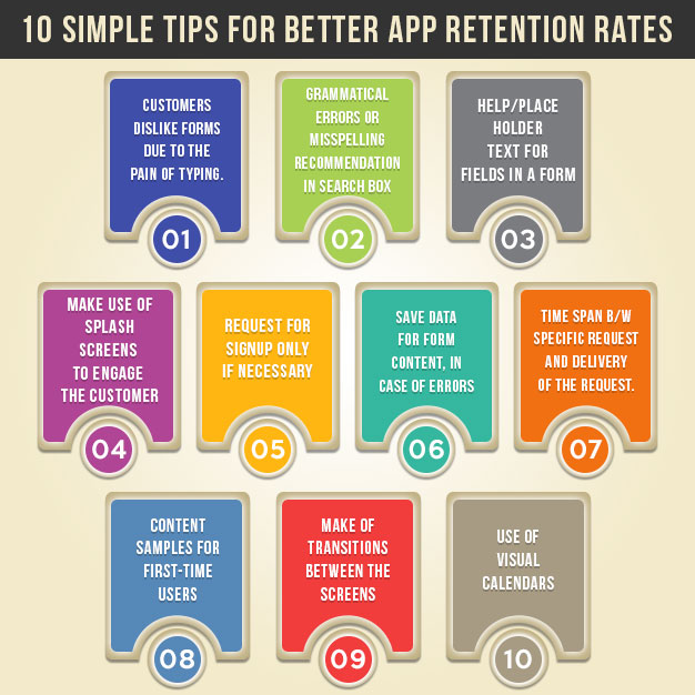
Tip 1: Make use of splash screens to engage the customer
Customers hate waiting for apps to respond to different actions or even it is loading. Often many do not realize “this time” along with the screen space can be utilized to grab the customers’ attention. Splash screens can be used to provide simple, short messages or information to engage a user. So making use of splash screens is often recommended, but need to be used wisely and effectively.
Tip 2: Request for signup only if necessary
Signup is not required for every app. The only reason a signup would be deemed as absolute is when the need to personalize the user experience. Any unwanted features including a signup could see users moving away from the app, with just a single session. Many apps understand this problem and provide a guest option. This will help new user to explore the app and if they are satisfied, they could take the urge to sign up. Please ensure that a higher level of personalization, convenience and if possible a better user experience is available for the users who log in.
Tip 3: Ability to save data for Form Content, especially in case of errors
This is one of the features which can turn on or turn off a user. Nothing more annoying can happen to a customer if the form clears all the information provided because of an error. It would be much better to have a technique to ensure the data in the form saved and not get erased due to errors.
Tip 4: TtV
TtV is nothing but the time span between a specific request and delivery of the request. When it comes to apps, that means users need to access the app as fast possible. Unlike web users who look to explore other areas of the application or brand, mobile app users are very specific. They have a specific need and a specific task to perform. Any extra time in completing that goal including a long waiting time is seen as frustrating and deterrent. So, it is recommended to have a quick loading time and shorten the TtV.
Tip 5: Progress bars
Customers dislike forms due to the pain of typing the information. Anything less taxing when it comes to forms is seen as a relief for users. One such feature is the progress bar. With longer forms, it’s much better to show users the amount of progress they made with the progress bar. Importantly it motivates them to get through the long form.
Tip 6: Grammatical errors or misspelling recommendation in search box
Most users are bound to use the search function as the main point of navigation. There are times users could misspell a word or make grammatical mistakes. It is vital to make suggestions and get those rectified as it helps in two ways. One, it helps in getting the right keywords for the search to be faster and better. Two, it helps the customer to understand the terms required and increase the engagement.
Tip 7: Help/Place Holder text for fields in a form
Many a time users get confused with the information being asked. A big help in such cases would be a simple help functionality or a simple placeholder text which explains and instructs users, what data is expected from them.
Tip 8: Content samples for first-time users
First-time users have neither an idea of your app nor any data in the app. It would be much better and realistic to design sample content for some of the space than showing blank screens. Two big advantages come with this move. One- it shows and teaches the first time user in a subtle manner on how the app performs or is to be used. Two- It increases the retention probability of the users. Instead of aborting the next step or the app, it could lead the user to the next logical step.
Tip 9: Make of transitions between the screens
Often, users find themselves lost when they move from one screen to another. Transitions can help in such cases and often aid confused users especially the first-time users. Transitions could ease the stress of users who are delaying with a new and a different interface.
Tip 10: Use of visual calendars
Users feel tedious and boring when it comes to long forms or when bombarded with tons of questions. One of the popular questions while signing up is the date of birth. Instead of asking the user to manually enter the date, make use of visual calendars. In this way, users can save time.
Conclusion
A great user experience for the apps can only come with a great UX. And a great UX translates to good business. Making use of tests like usability assessment tests could help in improving the UX of the concerned app.

Still have your concerns?
Your concerns are legit, and we know how to deal with them. Hook us up for a discussion, no strings attached, and we will show how we can add value to your operations!