Leading Cross-Platform Web App Development Company
Cross-Platform Web Apps
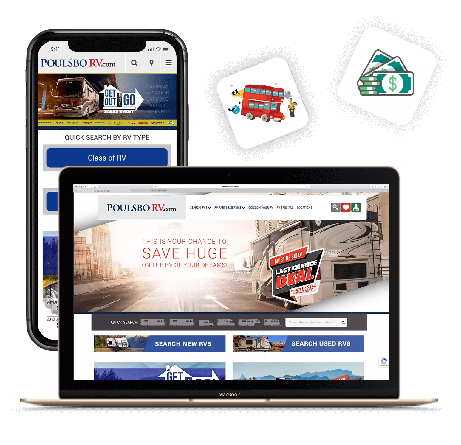
Promatics Technologies is a premiere provider of cross-platform web applications. Our cross-platform web applications deliver a consistent user experience across all devices, including mobile phones, tablets, laptops, and desktops. The engineers at Promatics Technologies will work closely with your team to develop an application that has been built specifically for your workflows, business processes, and digital ecosystem. In addition, we custom-design all of our solutions to provide unmatched usability, reliability, and long-term flexibility.

180+ Mobile-Responsive & Cross-Platform Web Apps

Deliver Seamless User Experiences on Every Device
Our web solutions are mobile responsive, cross-platform, and designed to provide a consistent, high-performing user experience across all devices and screen sizes (desktop computers, tablets, and smartphones) thus increasing the ease of use, accessibility, engagement, and overall usability of your application.
Tailor-Made User Experience
Layouts are automatically optimized for best readability and navigation, regardless of the mobile, tablet, or desktop device.
Unified Experience Across Browsers
All major browsers are fully supported, including Google Chrome, Apple Safari, Mozilla Firefox, Microsoft Edge, and top mobile browsers, providing compatibility and a seamless performance experience.
Fast Performance for Mobile Devices
Cross-platform web applications are quickly loaded, with less latency, and provide faster rendering, which improves the user experience.
Easy-to-Touch Interactions
By designing tap-friendly buttons and creating easy-to-use gestures and flows, we provide users with better access to the web app and a better mobile user experience.
Uniform User Experiences Across Devices
We create a uniform user experience and behaviour across all devices (i.e. Android, iOS, Windows, and macOS). This increases customer satisfaction and reinforces brand consistency.
Increasing Accessibility & Exposure
With the help of our web app, you can become accessible to a much larger audience, resulting in a larger number of people interacting with your web app, which in turn will generate a higher rate of engagement and conversions.
Trusted By
Empowering Global Brands and Startups to Drive Innovation and Success with our unparalled expertise and commitment to excellence


How We Engineer High-Performance Custom Web Apps
Phase 1
Discovery and Requirements Analysis
Process of defining the users, their behaviour on each device, the points where the user interacts with the device and creating an overall UX/UI.

Phase 2
Responsive Architecture
In this phase there are items like grids, breakpoints, components, and tech stacks to figure out what best fits as an architecture and framework (i.e. the design).
Phase 3
Mobile First Design and Prototyping
Developing all the mobile-first design concepts, creating all of the different interactive flows based on device types, and a design for each mobile device type.
Phase 6
Deployment and Performance Tuning
Deploying a well-optimized site via a CDN, cache, and compression methods and applying speed optimization methods.
Phase 5
Cross-Browser and Cross-Device Testing
Performing tests across all major devices, browsers, and resolutions, as well as testing for all different types of orientation changes.
Phase 4
Front-End and Back-End Development
Building fully scalable and responsive applications for all device types, based on modern frameworks.
Phase 7
Continuous Improvement and Monitoring
Adding new features, improving page load time, and adding improvements to the user interface.
This is how we build reliable, scalable IT Solutions
Now let's build yours, backed by a structured process and experienced team.
Start Your ProjectOther Services
Hire Cross-Platform Web Apps Developers
Hire Mobile-Responsive & Cross-Platform Web App developers to build scalable, high-performance applications that deliver a consistent user experience across multiple platforms and devices. Our expert developers leverage modern frameworks and best practices to create secure, responsive, and feature-rich web apps, reducing development time and costs while ensuring faster go-to-market. From planning and design to development and deployment, we focus on creating flexible cross-platform solutions that align with your business goals and support long-term growth. Ensuring optimized integration with existing systems and third-party APIs for enhanced functionality. With a future-ready architecture, we help your applications scale effortlessly while maintaining performance and security.
