From Pixels to Product Launch: A Complete Mobile App Development Guide
In the rapidly evolving digital landscape, mobile app development has become one of the most powerful drivers of business growth. From startups building MVPs to enterprises launching scalable digital ecosystems, mobile applications are now central to customer engagement strategies.
However, one critical factor that directly influences app success yet is often underestimated is understanding screen size vs screen resolution.
With thousands of Android devices, multiple iPhone variants, tablets, foldables, and ultra-high-resolution displays available in the market, screen adaptability is no longer optional. An application that looks flawless on one device may appear distorted, cramped, or blurry on another.
To build scalable and high-performing mobile applications, businesses must understand both the fundamentals of display systems and the structured process of mobile app development. This blog covers both.
What Is Mobile App Development?
Mobile app development refers to the process of creating software applications specifically designed to operate on mobile devices such as smartphones and tablets. It involves multiple stages, including:
- Idea validation
- Market research
- UI/UX design
- Front-end and back-end development
- API integration
- Testing and quality assurance
- Deployment
- Ongoing maintenance and optimization
Modern mobile app development focuses not only on functionality but also on performance, scalability, responsiveness, and device compatibility.
A well-built mobile application must:
- Work across multiple screen sizes
- Adapt to various resolutions
- Maintain UI consistency
- Deliver smooth performance
- Scale as user demand grows
Understanding screens is where this journey begins.
Screen Size vs Screen Resolution: The Core Difference
Many businesses use these terms interchangeably but they are fundamentally different.
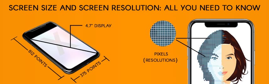
What Is Screen Size?
Screen size refers to the physical measurement of the display, measured diagonally in inches.
Examples:
- 6.1-inch smartphone
- 6.7-inch flagship device
- 10-inch tablet
- 12.9-inch iPad
Screen size determines how physically large the display area is.
But it does not determine how sharp your app appears.
What Is Screen Resolution?
Screen resolution refers to the number of pixels displayed on a screen, written as width × height.
Examples:
- 1280 × 720 (HD)
- 1920 × 1080 (Full HD)
- 2532 × 1170 (Retina display)
- 3840 × 2160 (4K)
Higher resolution means more pixels, which translates into greater visual detail.
Why This Matters in Mobile App Development in 2026
Two devices can both have a 6-inch display but if one has higher resolution and pixel density, it will look sharper and clearer.
This impacts:
- Icon sharpness
- Image clarity
- Typography readability
- Layout spacing
- Touch target sizing
- Perceived app quality
In professional mobile app development services, resolution handling is built into the architecture from day one.
Apps that fail to account for screen variations often suffer from:
- Blurry images
- Cropped layouts
- Overlapping UI elements
- Poor usability
- Lower user retention
Adaptive design is not a feature, it’s a foundation.
Pixel Density (PPI) and Its Impact on UI
Pixel density, measured in Pixels Per Inch (PPI), defines how tightly pixels are packed into a screen.
Higher PPI = Sharper visuals
Lower PPI = Less detailed output
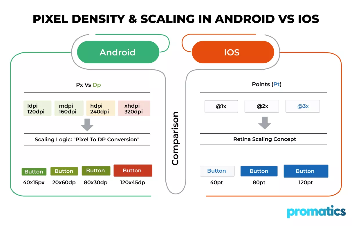
Android uses:
- Density-independent pixels (dp)
- Scalable pixels (sp)
iOS uses:
- Points (pt)
- Retina scaling factors
Handling these differences correctly ensures proportional UI scaling across devices.
This is a core responsibility in Android app development, iOS app development, and cross-platform app development.
The Complete Mobile App Development Process
Now let’s walk through the structured lifecycle of mobile app development.
Step 1: Idea Validation & Business Strategy
Before development begins, businesses must define:
- What problem the app solves
- Who the target audience is
- How the app generates revenue
- What platforms it supports
- What differentiates it from competitors
Strategic planning reduces risk and ensures market alignment.
Step 2: Market Research & Competitor Analysis
Understanding competitors prevents duplication and helps identify innovation gaps.
This stage includes:
- Competitor feature mapping
- User persona development
- Platform selection analysis
- Market demand evaluation
- Monetization strategy planning
A strong research foundation improves long-term scalability.
Step 3: UI/UX Design & Resolution-Aware Wireframing
This stage is critical for screen adaptability.
Professional UI/UX design includes:
- Responsive grid systems
- Flexible layout frameworks
- Adaptive spacing models
- Accessibility optimization
- Multi-device mockups
At Promatics Technologies, UI/UX and development teams collaborate closely to ensure resolution-aware design systems from the beginning.
Rather than designing for one device, we build systems that scale across entire device ecosystems.
Step 4: Choosing the Right Development Approach
You can choose between:
- Native Development
Separate apps for Android and iOS.
Maximum control over platform-specific features.
- Cross-Platform Development
Single codebase for both platforms.
Frameworks include Flutter and React Native.
Each approach requires resolution handling strategies.
Cross-platform mobile app development requires careful viewport management to ensure consistency across operating systems.
Step 5: Development & Engineering
This is where strategy becomes execution.
Development includes:
- Front-end UI implementation
- Back-end API integration
- Database architecture
- Adaptive layout coding
- Density-aware asset integration
- Device compatibility simulation
At Promatics Technologies, our mobile app development services focus on building resolution-aware applications that maintain visual integrity across Android, iOS, tablets, and foldables.
We engineer apps to be device-adaptive and future-ready.
Step 6: Testing Across Devices and Screen Variations
Testing includes:
- Functional testing
- UI consistency testing
- Multi-resolution testing
- Real-device testing
- Orientation testing (portrait/landscape)
- Performance benchmarking
Device fragmentation especially impacts Android app development, where hundreds of device models exist.
Comprehensive QA prevents post-launch usability issues.
Step 7: Deployment & App Store Optimization
After testing, apps are prepared for:
- Google Play submission
- Apple App Store submission
- Store listing optimization
- Resolution-optimized screenshots
- App metadata optimization
Proper visual presentation in app stores improves conversion rates.
Step 8: Ongoing Support & Performance Scaling
Mobile app development does not end at launch.
Post-launch services include:
- OS update compatibility
- Security updates
- Feature enhancements
- Performance tuning
- Analytics monitoring
As screen technologies evolve, applications must evolve too.
How Promatics Technologies Delivers Scalable Mobile App Development
At Promatics Technologies, we approach mobile app development as a strategic engineering investment.
Our services include:
- Android app development with density-aware architecture
- iOS app development optimized for Retina displays
- Cross-platform development for unified UI behavior
- UI/UX design services focused on adaptive systems
- Product engineering for scalability
- Responsive web application development
We build mobile applications that are optimized for diverse screen sizes, resolutions, and device ecosystems ensuring consistent performance and long-term scalability.
Why Resolution-First Mobile App Development Matters for Business
Businesses that prioritize adaptive design experience:
- Higher user engagement
- Lower uninstall rates
- Better app store ratings
- Improved brand perception
- Reduced redesign costs
In contrast, poorly optimized apps face higher churn and negative feedback.
In 2026 and beyond, resolution-aware mobile app development is a competitive advantage.
Final Thoughts
Understanding screen size and screen resolution is essential for delivering seamless mobile experiences. Screen size defines physical dimensions, screen resolution defines visual detail, and pixel density defines clarity. Together, they shape overall user experience across devices.If you are planning to build a high-performance mobile application optimized for diverse screen environments, Promatics Technologies can help you design, develop, and scale with confidence. Let’s build an app that performs flawlessly on every device.
Frequently Asked Questions
1. What is the difference between screen size and screen resolution?
Screen size refers to the physical dimensions of a device’s display measured diagonally in inches, while screen resolution refers to the number of pixels displayed on the screen. Screen size affects physical dimensions, whereas resolution affects visual clarity and detail.
2. Why is screen resolution important in mobile app development?
Screen resolution directly impacts image sharpness, typography clarity, and UI consistency. In mobile app development, adapting to multiple resolutions ensures that apps look professional and function correctly across devices.
3. How does pixel density (PPI) affect mobile applications?
Pixel density determines how tightly pixels are packed on a screen. Higher PPI results in sharper visuals. Developers must account for pixel density to prevent blurry images or misaligned UI components.
4. What is the best approach for handling multiple screen sizes?
Using responsive layouts, density-independent units, scalable assets, and adaptive design systems ensures consistent behavior across screen sizes and resolutions.
5. Should businesses choose native or cross-platform mobile app development?
It depends on project requirements. Native development offers maximum performance and platform-specific customization, while cross-platform development offers faster development cycles and cost efficiency.
