Use of Fonts in Mobile Apps: Understanding Typography from A to Z
What is Typography?
How many times have we shrieked at the sight of visually unpleasant app pages with amiss font style and size that mar the app usage experience on the whole? Countless would be the answer. Such apps lack the necessary sticking factor that helps us stay on the app. It is common to see the wrong choice of typography ruining the user experience and almost compelling users to exit the app platform.
Typography is a crucial part of design philosophy. Essentially, it constitutes the art of organizing written text, point sizes, line-spacing, and other elements in a way that they make an engaging and readable user experience. It can make or break an app experience. It contributes to stellar engagement rates and user experience in apps.
Using typography, app designers can transform the way humans interact with an app product. Typographic elements convey the tone of the message to an app user and add significantly to app UI design. Designers often play around with innovative typography styles to add fun and excitement to the screen, wherever necessary. We at Promatics rely strongly on typography to boosts the visual appearance of a mobile app. We ensure that our choice of styles and fonts facilitates content delivery to the user and connects with them. The typography we choose resonates with our client’s brand vision, customer behaviour, and market standards to create a positive impression on the audience. We have worked with numerous clients to build mobile apps that boost sales due to excellent user experience, and typography remains a significant factor in all our app products. Here is a quick guide explaining all that we have learned so far:
Different Parts of Typography
a.) Typeface
Sets of symbols, numbers, letters, and characters that share similar features are called typeface.
b.) Font
Quiet synonymous with the typeface, Font is a type of typeface which is set in a particular style, size, and height.
c.) Line Length
Another design element crucial to the art of Typography is Line length, that determines the area covered by a block of text positioned between the left and right margin. We can easily calculate line length using by counting the total number of words or characters in a particular line.
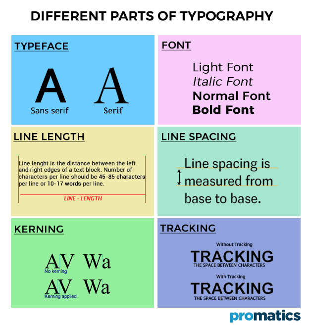
d.) Line Spacing
Leading aka line spacing is the distance established between two baselines,
e.) Kerning
Kerning is essentially the spacing between two particular characters or letters.
f.) Tracking
Tracking is the spacing between two individual blocks of texts and is better known as letter spacing. It enhances the user interface a great deal.
Tips for Using Correct Typography
Tip #1 Typography Elements Need to Complement the Mood of the Message
There is a range of typographic elements that can be explored to convey different types of brand messaging in an app. While some elements are simplistic and friendly, others are fancier to look at. Experienced UI designers use the vibes that particular type of typographic elements exudes to convey the mood of the message on a mobile app. Both system fonts San Francisco and Roboto are clean sans-serif designs; they are great for legibility on buttons, menus and headlines.
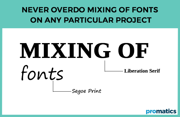
Tip #2 Never Overdo Mixing of Fonts on Any Particular Project.
Too many fonts on any given app page spell clutter, discouraging users from reading with intent. Keep the app design limited to a certain number of fonts that resonate with the brand mood. Ideally, avoid using more than two typefaces on mobile. So the app design becomes visually palatable for a visitor. The typefaces that designers choose need to complement one another. Opt for faces that utilize a similar character width, so that although the design of each face may be contrasting well with the other, there is an underlying uniformity for a visitors’ eyes.
Tip #3 All Text Flourishes with Hierarchy
UI designs thrive with proper hierarchy. Not only does it facilitate more comfortable navigation of all content, but it also helps with better organization of every element. It simplifies the process of finding information for the users. Designers need to exploit text sizes to prioritize data by importance. Even the same font can be used in varying sizes to create a ‘hierarchy-like’ impression. Appropriate spacing can make the content adequately scannable.
Tip #4 Spacing and Alignment are Crucial
Spacing and alignment work a great deal in increasing the retention quality of app content. The right amount of spacing and alignment in-app content makes it easier for users to grasp the information and respond effectively. Tightly tucked app content or centrally aligned text fails to interest user quickly and causes them to exit the platform.
Tip #5 Know The Prescribed Minimum Font Size.
The portable nature of mobile apps in combination with limitations associated with the screen size, sun-glare, visual impairments among users, below-average screen quality leads us to the ground rules governing the minimum size for body text. While Apple recommends setting the minimum size for Body text to be 17pt, Google recommends the minimum size for Body text to be 16sp (equal to 16pt in iOs). Bottom line is avert using font size less than 16pt for the Body text in the app design. Apple allows using Dynamic Type Sizes technology which will enable users who set an increased or decreased font size in the system settings to see the interface of your app according to these settings.
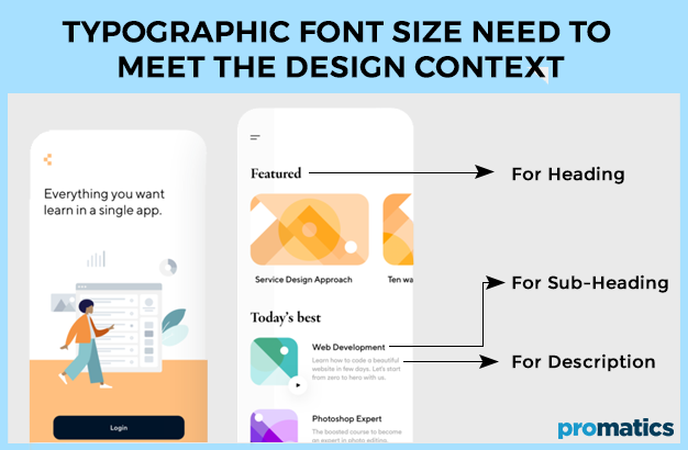
Tip #6 Typographic Font Size Need to Meet the Design Context
Font’s point size dictates the flow and readability of text to a great deal. Mobile app designers need to select just the right font point size for their app’s UI design if they wish to boost engagement. The rule of thumb dictates that it is wise to keep body text between 15 to 20 pixels for the web. The focus should be on choosing a typeface that stays legible on smaller screen sizes, without imposing a strain on the user’s eyes. Also, note how the typeface may look when translated to a different language. Make sure your typeface supports the multilingual text.
Tip 7# Focus on Headlines
Broad headings are widespread in modern digital typography as they serve a contrast with the main text and become anchor elements on an app page. However, large size for headings results in them stretching to 3–4 lines while containing just 1 or 2 words per line. This makes it hard to read. It is best to choose a headline size that is both contrasting with the body text and fitting on average 2–3 lines.
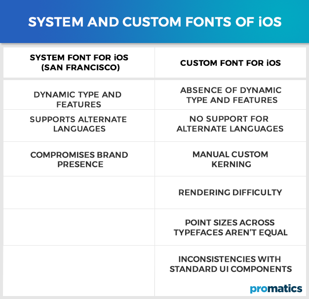
System and Custom Fonts of iOS and Android
Both Android and Apple’s operating systems feature default typefaces, these are called system fonts. Using system fonts in-app design make it more consistent with the operating system, but they do not create a unique look for the app. Android uses two typefaces for its platforms like desktop and mobile, namely Roboto and Noto. While Roboto is the primary default typeface, Noto is the secondary backup for websites that don’t accept Roboto. Roboto has a number of font families that a designer can choose from.
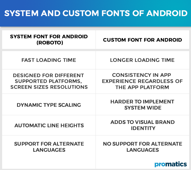
On the whole Roboto is a clean and merely stylized typeface that doesn’t convey much of a personality, but it’s a safe, smart choice. Apple has its own system typeface, i.e. San Francisco. It is a fundamental choice and nothing flashy. Apple prescribes a classic and straightforward typeface that never hampers the legibility or readability of your text.
To integrate a custom font into the design of a mobile app, designers need to learn all the nuances of a license. Font distribution conditions vary significantly for every font and need to be studied in great detail.
Conclusion
Reduced screen real estate in the form of mobile devices and ‘the culture of haste’, hardly complement experimental typography choices for mobile apps. App designers grapple with the need for creating a visually engaging and unique app experience while still keeping it amiable with platform design guidelines.
Our team of prolific app designers at Promatics, swear by the beauty of hand-drawn fonts as they add a sense of humane sensibility to the app design and encourages users to connect more easily. The focus is also on a varied set of symbols and non-alphanumeric characters like dividers and icons. We often add accents to the typography of mobile apps is using system font for the body text and various controls and non-default fonts for headings. This is a clever hack that churns fresh looks for our app products.
We hope this detailed article helps you with all you need to know about using fonts in app design. If you have any questions, just ask away!
