10 Cardinal E-Commerce UX Mistakes You Cannot Afford to Make

E-commerce: The way to be connected to the world
Ecommerce has slowly become a critical component of corporate strategy and a powerful stimulus for economic development in the rising global economy.
As e-commerce grows, increased competition, cost savings, and changes in seller pricing behaviour
may all lead to decreased inflation.
Having an online store to sell their products/services can assist a wide range of organisations, Start-ups, small and medium-sized firms, and large global corporations.
People’s lives are busy, and going to a physical store requires time and effort. As a result, by opening an online business, you can accommodate your customers’ hectic schedules by having the things they want available when they want them.
Buying alternatives that are quick, easy, convenient, and user-friendly and the opportunity to transfer payments online make eCommerce so appealing.
E-commerce can be tricky!
Many shops and business owners are still attempting to grasp the notion of website building.
Creating your e-commerce website is no easy task, especially if this is your first attempt. E-commerce websites are more than just places to look for product listings and catalogs. No, the platform provides users with a complete purchasing experience, which includes page design, payment choices, etc. Building a shopping website is only the first step; after your business is up and running, the real work begins.
Who says you have to learn things the hard way as a beginner? Learning the ropes of e-commerce through trial and error isn’t the most efficient or profitable method.
10 Common E-commerce UX Mistakes to Avoid
Web design evolves on a monthly basis, with new trends and techniques appearing. It can be difficult to stay up with the latest design trends, but keeping the core concepts of UX in mind should not be too difficult. Human psychology doesn’t change all that often; we are just continuously discovering new ways to understand your regular user’s attitude
better.
Creating a positive, interactive user experience (UX) is critical. It’s also critical to avoid UX traps that may drive users away. Here are ten of the most common blunders that web designers should avoid.
I. Not Optimized for mobile phones
Rather than using their desktops or laptops, a substantial percentage of internet users utilise their cell phones to access the internet. As more people move to mobile phones, these records have only improved. As an e-commerce business owner, you should do all possible to capitalize on this opportunity.
A website developed exclusively for a desktop screen is inaccessible to mobile users. For e-commerce stores, responsive design is not only a demand but a must. Many e-commerce site-building systems allow users to develop mobile-optimized websites that can be seen and accessed on various screen sizes and devices.
II. No Integration with Social Media
There’s no way around it: if you intend to be a competitive business, you need a social media strategy. look at the numbers for yourself. 70% of Instagram users engage with brands they follow on a regular basis. Instagram has moved to the top of the customer-brand interaction rankings in a short period of time. So, how can you get the most of this opportunity? Advertising with Facebook and Instagram is a great way to take advantage of the user data they control if it’s in your budget. To sell your goods online, you can target a very precise demographic.
Remember that video content has a 40-fold higher chance of causing a buyer to act. If high-quality product videos and paid advertising aren’t in your budget, contests, customer chats, hashtags, tutorials, sharing customer stories, and engaging with company peers in the same industry are the greatest ways to grow your brand on social media.
III. Page Loaders
Based on how long it takes a visitor to leave a website, the ideal loading time for a web page is 2-3 seconds. Your website’s loading time must fall inside that range. Larger websites employ creative loaders to allow for more time to load all of their content.
Create a one-of-a-kind page loader for your website. Most page loaders are badly built and take far too long to complete. If your website takes longer than 4-5 seconds to load, include a percentage bar in your design to encourage customers to wait by letting them know when the load will be completed.
IV. Complex Website Navigation
Is there a clear hierarchy on your website that divides products into logical categories and subcategories? If this is not the case, it will fail to engage visitors and convert them into paying clients.
As a general guideline, customers should be able to reach any product page on your website in no more than a few clicks. They should be able to return to the homepage from any page on your website with ease.
V. Product Pages That Aren’t Impressive
A poorly designed product page is the fastest way to push potential clients away from an online company. There’s a lot that may go wrong on the product page: outdated or erroneous descriptions, low-quality photos, and misleading prices.
The trick is to lure customers with eye-catching product photos and videos and clear and concise writing. To imitate the impact of physically handling a product in a store, make sure all parts work together.
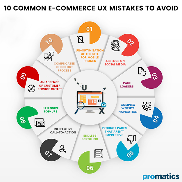
VI. Endless scrolling
Even though endless scrolling solves issues such as retention, it has significant disadvantages. When an individuaal gets to the bottom of a page for information you’d expect to find in the footer, you’ll find yourself scrolling endlessly, which can be frustrating.
Another issue occurs when you navigate to another page while in the middle of an infinite scroll page. It will be extremely hard to locote the point when you drift off to another page with infinite scrolling. You return later and wish to resume your reading.
VII. Ineffective Call-To-Action
When you access a website’s main page, call to action buttons appear nearly instantly, grabbing the visitor’s attention. Your website can have the most exquisite design and content, but if your visitors don’t know what to do with it, it will be useless.
The CTA button instructs your customer on how to express their interest and receive the greatest deals and discounts available on your website. CTAs, on the other hand, should be used sparingly in your store. Large pop-up buttons should not be used on every page because they confuse the reader.
VIII. Extensive Pop-ups
This is a cautionary story that has been passed down through the generations. You’d be shocked how many websites still utilize pop-ups simply because they believe that putting their best foot forward is a good idea. It may work for some websites, such as e-commerce stores, where pop-ups advertise bargains, but aside from that, it is almost always damaging to your users’ experience.
IX. An absence of customer service outlet
Customers don’t have somebody to ask questions to if they don’t have someone to talk to in person. Consumers are frequently demotivated to buy when they have unanswered questions. They may be one click away from clicking “confirm the purchase,” but if they don’t know the answer to a key product question, they may cancel the sale altogether.
Marketers are increasingly concluding that implementing a live chat feature is a must. Quick responses keep customers motivated throughout the purchasing process. Make your company’s phone number and address prominently displayed or easily accessible. Most buyers are put off by the inability to locate company content information.
X. Complicated Checkout Process
Every eCommerce website’s ultimate goal is to attract new clients and increase sales. With a cumbersome checkout process, you won’t be able to accomplish this. Cart abandonment rates will increase if the checkout page is slow, unfriendly, or requires customers to sign up before purchasing.
Allowing guest checkout on your website is a simple method to prevent this issue. Customers should also be able to save their address, phone number, and payment information for future purchases. A simple checkout is a must for any ecommerce website.
The Ultimate Verdict
In the coming years, the eCommerce environment is expected to expand at an unprecedented rate. You can cash in on the trend by opening an online store that is quick, safe, responsive, and simple to navigate. By removing needless stages from the checkout process, you can improve the overall experience. Don’t forget to keep your product pages up to date as well.
The tech-savvy online customer wants a complete and convenient shopping experience in addition to profitable product bargains. Newcomers frequently make the above-mentioned easy errors in the profession. With a little knowledge and care, one can overcome these obstacles and dramatically boost your web appeal. Avoid these simple but dangerous e-commerce mistakes if you want to improve your website’s rating and develop your business internationally.

Still have your concerns?
Your concerns are legit, and we know how to deal with them. Hook us up for a discussion, no strings attached, and we will show how we can add value to your operations!