How old design practices are not effective for mobile


Mobile apps have become a main stream and are the best ways to attract customers. Companies are trying to create great mobile experience for customers by using the best design practices. However, not many are willing to make the changes required to deliver that promise. Most of the companies don’t even realize that how a ‘bad mobile experience’ can spoil their company’s reputation.
In this post, we have covered the fundamental approach of best design practices for mobile. Using the old design practices can be tempting. However, it can prove dangerous to the search strategy. When designing an app for mobile device, developers should focus more on responsive web design. If your clients are primarily desktop users, you don’t need to bother about mobile access. However, if the client wants an online store, you would better use a mobile first design approach.
Let’s have a look at few best design styles that are no longer effective. Avoiding these practices will ensure that the design of your app stays fresh and at the same time attracts large audience.
1. One task and multiple screens
There was a time when the users were asked to navigate across multiple pages to perform a simple task. Folder style navigation was a drawback as it fails to hook the users. Mobile app designers have recognized that keeping everything accessible on home screen is not a good option. Earlier, designers used to create an experience focused on initial intent. When the users want to open the app, they used to have a single goal to accomplish. Designers have embraced “less is more” approach by limiting visible options to important destinations only.
2. Use of negative space
Negative space or white space refers to the empty space between and around the elements of design. However, this area is often ignored or overlooked. Though many designers consider it as waste of valuable screen, it is an essential area in mobile design. The ‘white space’ is not only responsible for readability, but plays an important role in visual layout. Designers can simplify the UI by focusing on the white space.
3. Gradients
The use of gradients in mobile design is involved with lot of controversies. There are some companies that love them, while there are companies that hate using gradients in mobile design. Some gradients force people to take notice, while some gradients distract users. The key to use a gradient is to understandits role and the way it impacts the overall experience of the user. In most of the cases, designers use gradients just because they want, and not because they give better user experience. If the designers want to use gradients, they should better use it in such a way that it has an impact in overall user experience.
4. Embossed buttons
Outdated design trends like embossed buttons may spoil your brand image. Creating embossed buttons can remind the users of tangible button that were tapped on the screen. To show the interactivity, designers realized that they don’t have to hit the user’s head with visual hammer. Flat designs were introduced to send all levels of tutorials to archives. Flat designs are considered as the most persuasive shifts in mobile design in the recent years. Today, you will hardly find apps with embossed buttons.
5. Over-design
Earlier, designers used to think that cluttered mobile design will attract users. However, users love a streamlined look with easy navigation and right balance of text and images. Users don’t want to spend time picking through the clutter to find relevant information. Extra-large banners on the home page were highly in demand. It works for some apps, but most of the apps can’t pull off. These large size banners take up valuable space. The current design trend is to make effective use of the available space.
Now, the question is what the best practices for mobile design are?
Designers have been building mobile apps for a decade. However, as the technology continues to grow—- the understanding of users need to be refined. Getting a right mobile design can result in big payoffs. Here are some best design practices for mobile that help create a great mobile experience.
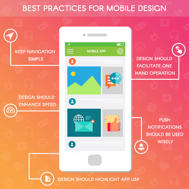
- a.) Navigation should be made simpler. Making mobile navigation accessible is a challenge on mobile due to the limitations of small screen and need of prioritizing content over chrome.
- b.) As the screen sizes are expanding, it has become necessary to adapt a design to improve overall experience. It is observed that more than 85% of users are working with phones using one hand, and hence, designers must incorporate one hand operation in the design.
- c.) Making the app appear faster is another best mobile design practice. Actions that are packed with background operations are invisible to the user, which will eventually enhance the user experience.
- d.) Push notifications should be used wisely. It is found that users get annoyed with useless notifications. And it is one of the common reasons why people uninstall their mobile apps.
- e.) The most important thing to consider when designing mobile app is to make it intuitive and useful. Apps that are not useful need a lot of time and effort. Moreover, people are not interested on how it works.
Keep the mobile design clean and simple. Remember that you are designing for a much smaller screen than desktop, and minimalism is the best thing you can do in mobile design.
Conclusion
There are always old and new design trends for mobile. As the taste of users change, reputed companies like Google and Apple are identifying the need to change mobile design. Companies are identifying which design aesthetics are best. Mobile design is all about usability of app. Sometimes, design is all about taste of the user and overall user experience.
Being an experienced mobile app development company in India, it is our responsibility to stay on the top of trends. We ensure that our clients are aware of what’s trending and what’s not. If you want to redesign your app that still embraces old design practices, get in touch with us.

Still have your concerns?
Your concerns are legit, and we know how to deal with them. Hook us up for a discussion, no strings attached, and we will show how we can add value to your operations!