How to talk to a UI/UX designer in his language?

Developing a successful mobile app for business requires close association of designers, developers and businesses. Coming from radically different backgrounds, all three tend to have different viewpoints for app design. While mobile applications have become a necessity for every modern business weather big or small, it is highly unlikely that a business owner has intricate knowledge about nitty-gritties of mobile app experience design. Unfortunately, a successful collaboration with a mobile app developing team or individual freelance developer can only result when the business owner understands the design terminology they use so as to communicate his ideas to them fluently. Here we present a basic intro and directory of app design and common design principles, to help educate non-designer about mobile app development and facilitate fruitful communication. If you are an app designer yourself, you can always help you clients gain a better understanding of your craft by referring this piece to them.
The Basic
User Interface (UI) can be defined as an interactive field containing a set of commands in which a user communicates with a particular program. User Experience (UX) is the terminology used to describe the effect of design that is used to ease the use of a particular program, site or app. Users interact with UI and what they feel is UX. UX is all about logic, connections and user behavior, while UI is a visual representation of the concept. Most generally the designers concern themselves with the UX like a powerful, well thought out, clear and easy to use layout. The UX part is then tested through a prototype before the designer starts the UI design part.
The UI/UX Glossary:
I. Sketching
To sketch is to draw for the purpose of proposing, exploring, refining and sharing ideas. A good sketch can be the stepping stone to a kickass UX design.
II. Wireframing
Wireframe can be described as highly simple sketch that conveys important information in a page. It lays out clearly all details that the final product would contain. It is also known as the page architecture, page schematic, or blueprint. It helps developers, designers, copywriters, managers to work together by keeping them on the same page.
III. Mock-up
A mockup is a medium or high-detail static representation of the design. A good developer can design a mockup that demonstrates the information structure, content and basic functionality all in static form. Mockups help convey the design without being time-consuming to create.
IV. Prototype
Prototype detailed representation of the final app. The main aim of developing a prototype is to enable a designer, a client and a user to see if the design planning is correct. A prototype allows the user to rate the content and interface and test the primary options for dealing with the app.
V. On-boarding Process
Developing an onboarding process means designing a welcoming experience for new users by engaging them in a hassle free manner. Most generally, it is limited to a first-time use scenario.
VI. Landing Page
The location on a website where a user goes after clicking a link is called a landing page.
VII. CTA
CTA or call-to-action means any element that stimulates users to interact with a product in a way that is profitable for the business. CTAs are ingrained in the layout design in the form of buttons, tabs, or links. Any app devoid of adequate CTAs risks poor conversion rate and user experience.
VIII. Information Architecture (IA)
Information architecture refers to the practice of organizing information and content in a meaningful and accessible way. This facilitates easy navigation in a product.
IX. A/B Testing
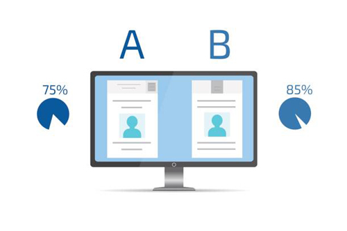
This method of testing requires a business to pick up two versions of your product and show them side by side to a group of users. The users need to assess which one of the two they like more. It is also called split testing.
X. Engaged Time
Engaged time is the amount of time that a user devotes to a specific page. This can be crucial info for a business to deduce what users want from your site. The number depends tremendously on content and the depth of page.
XI. Breadcrumbs
Breadcrumbs are essentially some distinctly placed navigation element that allows users to orient themselves within a Web site or move to one of the intermediate pages. They allow users to find their way to the homepage.
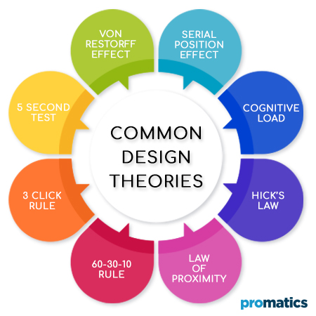
Common Design Theories:
A. Von Restorff Effect/ Isolation Effect
It is common psychological knowledge that when multiple similar objects are presented simultaneously, the one that differs from the rest is most likely to be remembered distinctly. Very often designers used this effect to highlight a call-to-action on a mobile app.
B. Serial Position Effect
The natural tendency of a user to best remember the first and last items in a series, describe the Serial Position Effect the best. Modern developers use bottom or top bar navigation placing the most important user actions to the right or left to exploit the benefits of this effect.
C. Cognitive Load
Cognitive load is the total amount of mental effort being put in by the brain to perform a certain task. Intrinsic cognitive load refers to the difficulty associated with a specific instructional topic. On the other hand, Germane cognitive load is dedicated to processing information and construction of schemas.
D. Hick’s Law
A well-proven psychological law, Hick’s law states that time it takes for a person to make a decision depends on the choices available to him or her. The more the number of choices increases, the time to make a decision increases logarithmically.
E. Law of Proximity
The Law of Proximity states that objects that are near to each other, tend to be grouped together. Humans have a natural tendency to organise and group things together.
F. 60-30-10 Rule
Most simple decorating rule followed for flawless design suggests that a color scheme of the design in consideration must use 60% + 30% + 10% proportion to give balance to any space or product.
G. 3 Click Rule
The 3 Click Rule Theory propagates that a user of website navigation should be able to locate any information in no more than three mouse clicks. If not so there is a risk that the user would abandon the page out of frustration.
H. 5 Second Test
The 5-second test collects a participant’s first impressions from a page when they come across it for a brief span of 5 seconds. It helps analyze the screen’s clarity and brevity with the help of simple questions like ‘what is the most crucial information on the page?’ or ‘what will you do to achieve your goal on the screen?’
Best Communication Practices for Business Owners
There are times when a layman can understand design terminology from the context it is being used in. However, to figure out the exact meaning of the term being used they are clueless. More often than not, there exists an awkward communication gap between clients and designers. Here are some fruitful communication practices that you as a business owner must resort to for a successful collaboration:
1. Avoid Vague Feedback
Very often, designer meet with responses like: “ I don’t like it/ It’s a bit off/ Something’s amiss here.” Even if a person who has put his heart and soul into designing something, needs to be open to criticism and rightly so. Productive criticism gives one a chance to improve and add value. However, vague and undefined responses can set a creator off. Be clear in your vision and elaborate what part of design is bothering you in particular and why.
2. Second-Guessing Design without Any Technical Knowhow
Very often we tend to undermine the expertise of the designers working with us. Dictating to designers about how they should do their job tarnishes the work collaboration. As a client you need to define the problem for the designer and not suggest design chances yourself. Let the designer be the one who finds the solution. Let the designer know what issue you or your audience might have, and trust them to fix it.
3. Ask Questions
Be quick in providing your feedback in early stages of design. Ask your designers about issues in the initial stages of the design process and this can save them a lot of time later on. As easy as it is to blame an unsatisfying final product on the designer, it’s best to take full responsibility as a client and be proficient in clear communication of goals you seek to achieve with design.
4. Answer The Designer’s Questions Clearly
Be efficient in providing all the necessary information as requested by the designer early on. Make sure you are clear in conveying the message behind the product.
We at Promatics, work with a variety of clients who come to us with ideas in mind that we bring to reality, virtually. While our clients try to be as clear in communication of concepts as they deem possible, limitation of knowledge about basic design concepts is often a barrier and incurs time wastage in process of mobile app development. We hope that knowledge of these basic terms relating to UI/UX design will help you access mobile app and web app development and design with more insight and a new approach.


