How to use vibrant colors to enhance the appeal of your app
Color is something which influences people psychologically. It has been found to have several connections with human beings and can help set a mood. Colors often have a meaning and you need to be conscious of what meaning you are conveying to the user. Designing an app with unique features and functionalities is not enough to grab the attention of users. It should have an appealing interface and you can make it possible by using vibrant colors.
Color can be said as one of the important aspects of mobile app after functionality. Every app has a color scheme, based on which the developer has to use primary colors for particular areas of app. Color plays a crucial role in human to computer interaction, helps users to see and interpret the content and interact with correct elements of the app.
Mobile app designers often face the problem of choosing the right color scheme, when designing the app. It is essential for them to make sure that the app design can be seen. One of the best ways is going vibrant or bold. Designers should often change the color scheme based on trends. When it comes to mobile app deign, this is the decade of vibrant colors.
There are many examples of designers that use bold and vibrant colors in their mobile app to make the app or its elements really create a wonderful affect. Even though designers prefer minimal design, they still use vibrant colors to create a memorable and fantastic look in a simple way. There are many themes, where designers found a nice balance between using bold and vibrant colors. From headers to backgrounds, the vibrant use of color in app design will inspire you find your way to use powerful elements in your next project.
Designers who use vibrant colors usually come up with unexpected color combinations. Vibrant colors help people to focus their attention on important elements while making the app design stand out and memorable.
In this post, I will help you understand how to use vibrant colors to enhance the appearance of your app.
Vibrant colors lost their stigma of silliness in 2016 and people started accepting them as professional colors. Today, vibrant colors are used in mainstream as well as traditional industries such as corporate, travel, gaming and other categories. Some of the useful color effects to follow when using vibrant colors in the app and mobile design are as below –
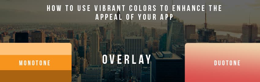
- Monotone
The best way to use vibrant colors is through monotone color palette, which includes the usage of single color with a lot of mixture of tones. The monotone color palette is visually stimulating and can create memorable experience, when paired with bold typography.
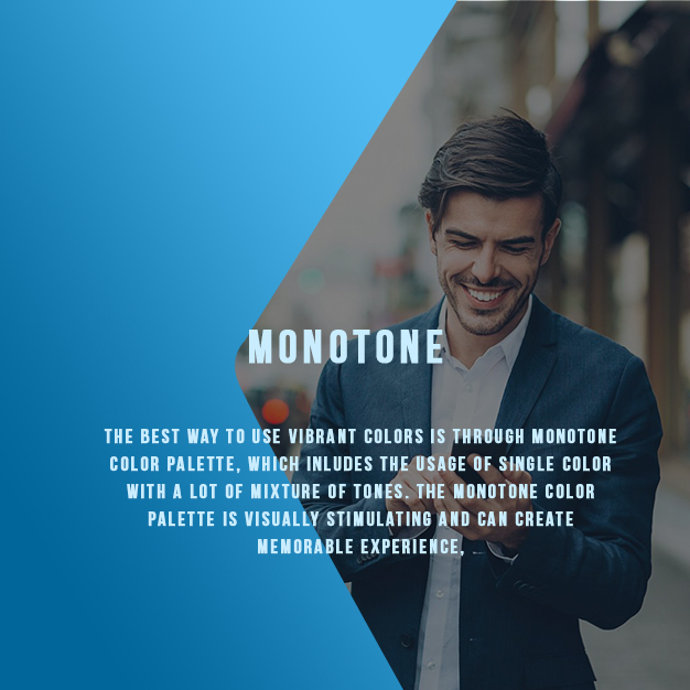
If you want to create visual interest on small screen, you should consider using a single color with bold black and white accents. This type of color effect can create cool visual for websites that do not have many images or illustrations. When combined with bold typography, monotone color effects can help you create a powerful design that makes your mobile app alive.
- Duotone
Duotone was once the print staple that has found its place online. It is the halftone reproduction of an image whose aim is to bring out the highlights and its middle tones. Designers can get this effect by using two-color gradient with Adobe Photoshop. Though this color effectrenders a pleasant effect on large desktop images, they can work well on smaller screens as well.
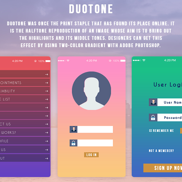
Duotone effect can be used to create a dominant image. All you need to do is select a simple, but high quality image that has a single subject. It is advised to choose colors that reflect the mood of image to evoke right emotion.
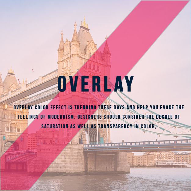
- Overlay
Overlay color effect is trending these days and help you evoke the feelings of modernism. Designers should consider the degree of saturation as well as transparency in color, when single color is selected as overlay. Heavier colors combination will give more focus on the color itself than the image behind. On the contrary, light color colors more focus on the image than the color itself.
Overlays are considered as regular feature in app design for sometime, as they move user out of the app’s regular flow. Some designers have cautioned against overusing overlays in mobile app design, suggesting that they interfere with navigation. If you want to incorporate overlays in design, make sure that they confirm an action or decision.
The overlays should not interrupt the crucial movement of the user. They should not include content that would be placed on a page of its own. Moreover, button placement should follow recommendations for common usage scenarios. Whether it is product information, video or image – overlays should provide in-depth look at that particular element.
Designers should remember that a large number of people have limited color vision. Your design should work well, in absence of color as well. Make sure not to show differences in term of hue as some people may have difficulty distinguishing between hues. Make sure to use different levels of saturation, tones and values.
Conclusion
It is always fun to play with vibrant and bold colors. You can make the design more impressive, dramatic and serene depending on the choice of colors. Vibrant colors lead the user feel more energetic and are commonly used for emotional response.
Vibrant colors such as – red, orange, green, pink, blue and purple have become the key colors in mobile app design. The result is the rainbow of bright and energetic colors that provides emotional direction for the design. Brighter designs are more likely to have higher conversion rates.
If you are facing any problem in designing your mobile app, contact us. At Promatics, we have a team of experienced developers and designers who can take care of your mobile app development project. They will guide you in choosing the best color scheme for your next project.
