The next stage of material design: How Google’s popular design language for Android is evolving?

If you are a regular follower of Google, you might have already heard about the next stage of ‘Material Design’. The company is expanding its services widely and hence offering a set of new tools and design iterations. Material Design has been used widely in visual design since its launch. The main reason behind this is its unification and intuition. Google wants it to take beyond the image of visual language. In this regard, it made a big announcement in Google I/O 2018.
If we take a look at the material design, we will see that it was very opinionated in style and design. A number of designers took it as the best thing that made designing easier. Google hasn’t made any major changes to the design. But, Google made it easier for developers to adapt material design in such a way that they can use it to their own projects. Here are a few important things to focus on Material Design 2.
Material Theming
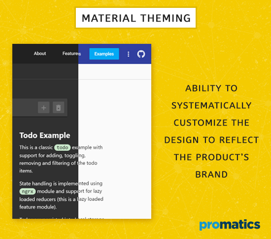
The biggest upgrade to Material Design is the Theming. Based on the upgrade, Material Design 2 has the ability to systematically customize the design to reflect the product’s brand. Usually, a brand is represented by colors, shapes, and typography in material design. You have to use multiple plugins to update the symbols and change the material components.
Material Editor
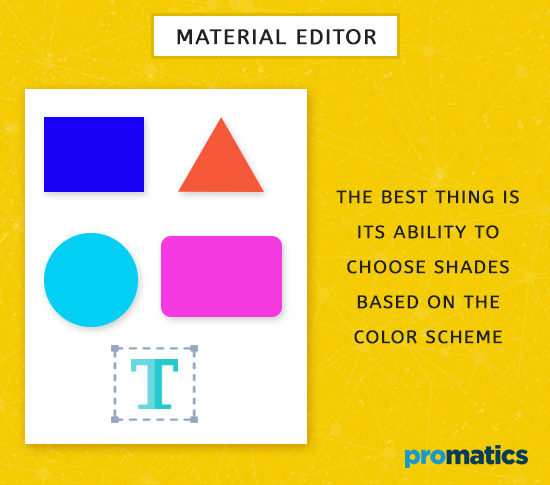
Material design 2 made it easier for developers to change colors & shapes, manage typography and do a lot more. Developers have 5 different styles of icons, which is something new in Material Design 2. The best thing is its ability to choose shades based on the color scheme.
Tweaking the designs still take some time. The material editor will allow developers to export their own theme based on the designs. There are more customization offers than before. However, the editor works only with sketch design app – which can be downloaded from the material plugin sketch.
The theme editor also allows designers to set up certain core design elements. For instance – if your design has a curved corner, the theme editor makes it easier to apply a curve in the app.
Icon sets
Besides the above, Google launched Icon sets for the material design. Based on this, the new icon themes can be customized in baseline, round, sharp, two-tone and outlined variations. Google also announced its work on new material components – which are nothing but a set of pre-designed components. This tool has been used by Google designers for years to collaborate in-house designs.
Gallery
The next feature is the gallery tool that let designers comment on their colleague’s designs. This tool is not only used share and collaborate designs but will allow developers to take those designs and bring them to the editor. The main objective of material design 2 is to give developers the necessary tools to adapt it to their design needs. The gallery feature allows attaching Google Doc, slides as well as sheets. Everything can be put together at a single place. If you upload a file with the same name, new versions of that file will be created. The inspect mode can detect symbols and show the links to relevant code.
Google has even updated the stylistic guidelines so that designers can build up with custom style on top of Material along with palette tools and new icon packs. Google has already started using Material Design 2 for new Gmail and task apps. There are many palette & font tools that give designers and customers a feel of nativity to their brand.
There are several mobile apps that have embraced this new look. We already have a pretty idea of what the new design looks like. As seen, the above changes have been visual in nature and with redesigned features. The concept behind the material design is to give the feel of virtual screen in real life. Users are likely to feel more engaged in using the web, especially when combined with mobile app interactivity.
Takeaways
Material Design 2 encourages developers to mix and match color palettes, layer styles, and fonts. The vibrant color combinations, depth effects, and grid-based layouts can help elements to stand out for the user. The open source large community adoption appeals developers the most. Whether it is making the templates, design standards or code snippets – the multiple design frameworks are available via GitHub.
The best thing is that it makes the user experience more enjoyable and organized for users. The feel is obviously great with awesome design and looks. You can learn more about Material Design 2 from its official website and a wide range of reworked apps that were released at Google I/O. It is likely that the revamped design will be in line with design changes in Android P and Chrome OS 67. However, it is yet to confirm.
With a focus on designing the best mobile app, app developers are looking for interesting app design trends to improve the user experience.


