Top 10 Website Design Trends to Dominate in 2022

Website design styles tend to float in and out of the ‘trend’ boat every few months. So, if your website still has a design following the layout of, say 2020, its success will quickly fall below the line. Stay on top of the dominating techniques to revamp your website, and it won’t get outdated anytime soon. But, to do this, you need to know about the latest “what’s hot, what’s not” of the website design industry. Here are some key points to remember for the upcoming year that’ll take the websites that add these designs to the top:
I. Communicative (Behavioral) Design
If you are developing a website that promotes its users to reach some goal or complete a milestone, communicative or behavioral design is what you have been looking for. This type of design ensures maximal attraction of users by analyzing the user’s behavior and combining the recorded data with an attractive design.
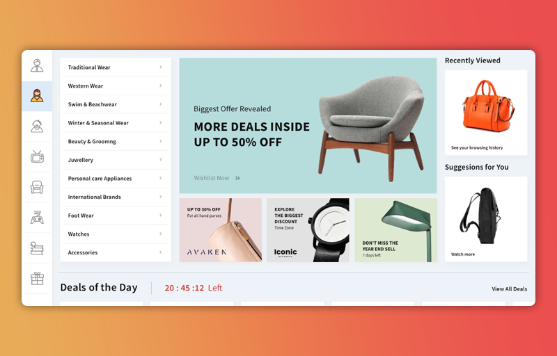
Some developers design their websites in such a way that with the help of the scientific data collected, they engage their users by employing techniques like the rarity of the desired product. For instance, many clothing websites have that “Limited Stock, Order Now” sign flashing on the user interface now and then.
Other apps and websites that adopt this design to make their business bloom and flourish include fitness and health-related apps. These apps gather the user’s data to understand their behavior better and, consequently, help them set up and maintain daily habits that suit them best.
If you’re still unconvinced that communicative or behavioral design will not dominate among design trends in 2022, take a leaf out of Designli’s books.
II. Unique Fonts
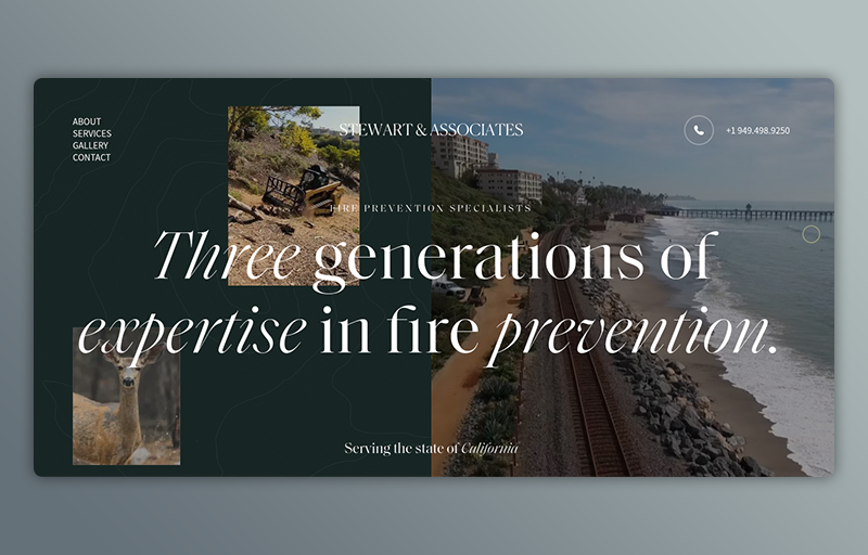
Our elders and previous generations have come up with some of the wisest stuff that we will get to hear. You can argue that they were not a hundred percent right when they said that the first impression is the last impression. But you cannot ignore the importance of how effective a good first impression can be. No doubt that the app or website’s functionality matters the most, but if the user interface is bland and straightforward, it will fail to attract as many users as you would want. On the other hand, if the opening headline and the following text have a unique font, it will convey the text and encourage your users to stay and convince them to keep coming back.
You would not want your user to get bored with text-heavy content, and that is where unique fonts make things interesting, even literally. In addition to having an engaging appearance, this type of design trend also helps highlight the main part of the conversation. So, if you have not released your final product yet, take some help from a proficient graphic designer and use the font that suits your website or app best.
III. Increase in 3D Elements
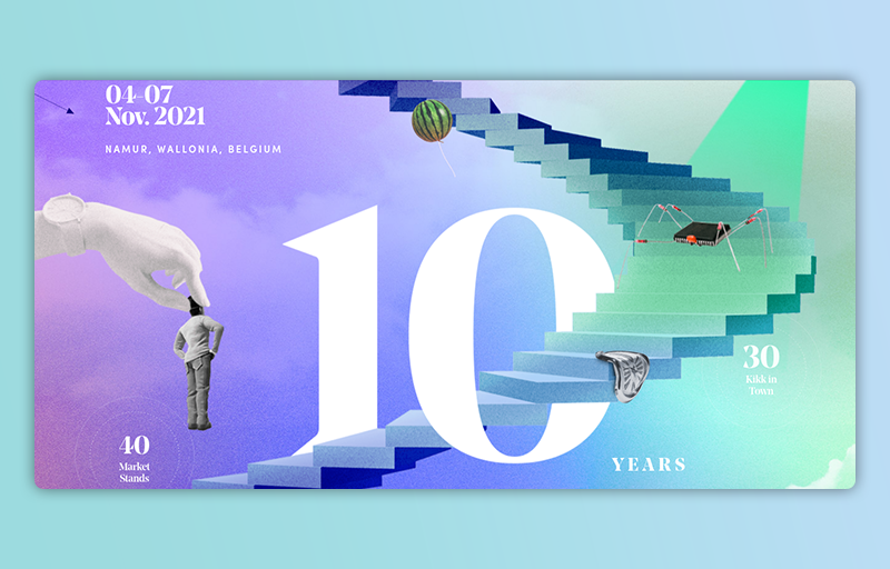
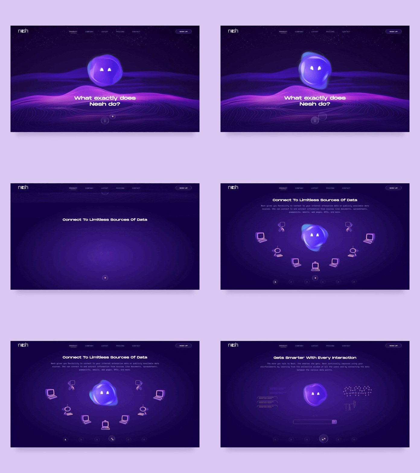
3D animations have been in this game for quite a while. Although, it took some years for both designers and users to get familiar with them. Now, an increase in 3D elements can be the marked difference between you and your competitors when it comes to design trends. Not many users want to read long, boring paragraphs, while the rest do not have the time for it. Whether you are developing a website or a mobile app, your user interface has to have eye-catching 3D images to attract this sort of audience.
The second advantage of 3D elements is that if the image is of any of the desired products, the user will have a good enough idea of how the product will look. Or, in other words, seeing the product’s 3D image is the next best thing to seeing the product with your eyes.
IV. Light/Dark Mode
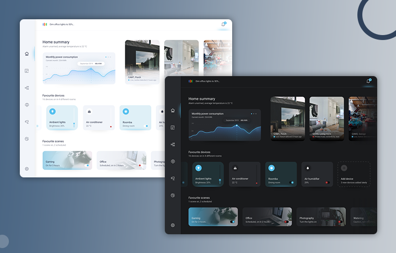
This is a fairly new design trend that has instantly gained immense popularity and admiration throughout the world. The color black and dark themes have become a fan favorite, and even you can not deny the touch of class and the aesthetic vibe that radiates from them. You know the light/dark mode was a success when mainstream apps like Facebook, Instagram, and YouTube joined in on the trend.
We would not recommend a strictly light or a dark mode. Instead, let your users toggle between them whenever they want to. Firstly, many users hate the idea of a constant theme and love change. These users will get bored of the dark or light mode if they use any of them for a long time.
Secondly, giving the users the liberty to change the theme whenever they want makes them feel like they are in charge and induces a sense of self-esteem, albeit on a small level.
Moreover, the dark theme saves the user’s mobile or laptop battery by economic energy consumption.
V. Micro Animations
Almost everyone who uses Instagram will have noticed those small, engaging, and creative GIFs in people’s stories. It is high time you start using these micro animations and attractive stickers. These are a bit different from micro-interactions, as these do not require a trigger to set off. Micro animations are a big yes when it comes to modern design trends. Here are a few reasons why simple, creative micro-animations that serve their purpose can be your business’s trump card:
a.) Grab attention: They hook up the user and keep them invested way more than static graphics do.
b.) Better navigation: Instead of using simple buttons, micro animations will help guide your users better and improve your website’s navigation.
c.) Improved feedback: Normally, if you hover your cursor over a button on your website, you will not get any feedback. But, if you add a micro animation, you can make the button change its color or conformation to give the user improved feedback.
VI.) Videos Everywhere
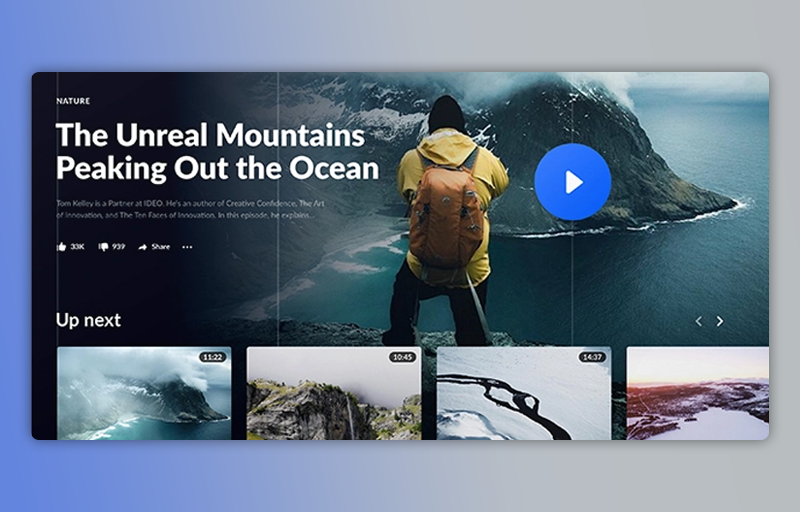
What is better than using images to describe your content? Videos! With the advancement in photography and picture editing, people seldom rely solely on pictures of the product.
Many online retailers upload doctored images of the product to attract customers. After several poor experiences, customers now need that extra surety before buying a product online. If your website or app has a video where your team is showcasing the product, not only will you create a bond of trust with your customers, but you will also attract your competitor’s clients and give them something to think about.
Additionally, videos and short, engaging clips on your website will increase SEO optimization. Since Google owns YouTube, you can even upload your videos on YouTube while embedding them on your website to give your website an additional SEO boost.
VII.) Contemporary Minimalism
Minimalism is the new hype, and it’s not only restricted to the website designing industry. With an abundant inflow of information and striking images and information throughout the day, users now prefer a more simplistic style.
Minimalism has numerous advantages, both for the designer and the audience. Website designers can now focus on more basic elements that complement the website’s overall look without adding too much on one page. On the other hand, stats show that the audience prefers a focused website that relays information and engages them without bombarding them with everything as soon as they click on the website.
In the website brand interface, the cream of the crop, such as Dropbox, Ted, and Amazon, incorporates this technique into their website pages.
The shift from everything-in-one-place to minimalistic style has taken over the market primarily because users rely more on mobiles and tablets than laptops. A minimalistic design will keep your website creatively cool and allow users to explore more of it when using these devices.
VIII.) Large Typography
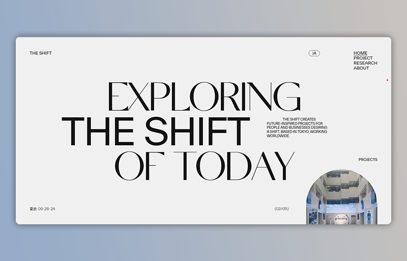
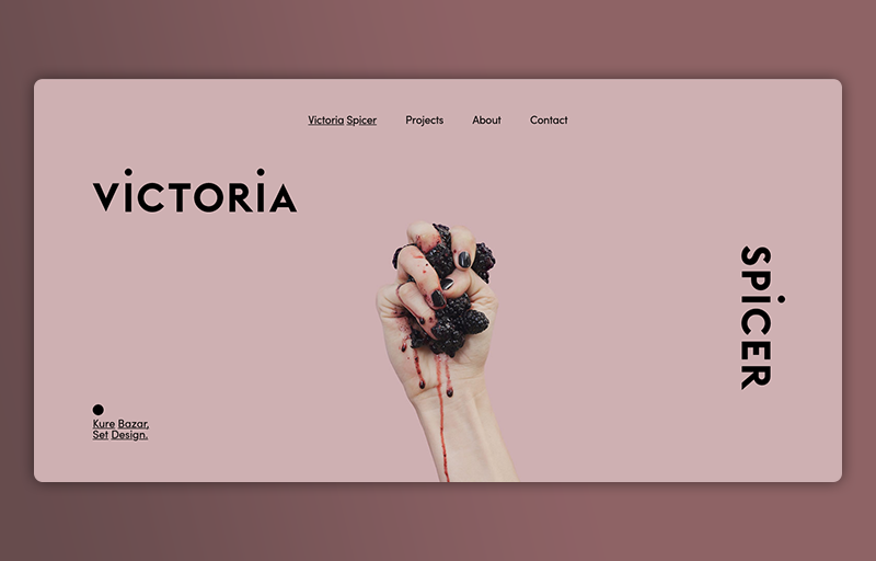
Large typography has set a foothold in the website designing domain once more this year. Combined with a minimalistic style, big and bold sets a definitive mark for your website’s aesthetics.
People no longer want to read small, squished-in, crowded paragraphs on a website. This gives website owners and designers an opportunity to use large typography to their benefit and highlight the sections of their website that are bound to attract and retain users the most.
For instance, e-commerce sites put up a massive banner with ‘SALE’ written as big as it can go so that anyone who visits the site knows that there’s a sale as soon as they see the right-in-your-face banner when they visit the site.
Undoubtedly, one of the biggest pros of this trend is that you don’t have to stick to a typical style within the massive typography context. If you’re tired of the usual dull fonts with black color for this trend, play around! You can use various fonts, as long as they’re easy to read and get creative with the colors.
IX.) Colorful Gradients
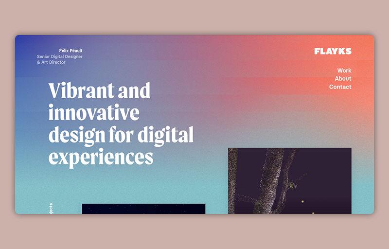
Complex, colorful gradients have started becoming more and more common as the doors of creativity and imagination have begun to open. Instead of uploading a flat image, add depth by applying a complex color gradient to it in the background. For instance, create a minty mix of purple, orange, and blue to add warmth to the picture.
There are several tools for creating the perfect colorful gradient for your website, and each has its advantages. For instance, Color Space Beta has a three-color gradient that is hard to find and use in other tools, while Grabient offers more accessibility and creativity.
X.) Voice-controlled Operations
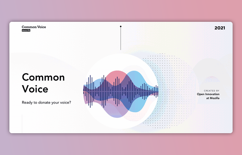
Experts have predicted that 2022 will see a tremendous surge in voice-controlled operations in websites. Google, Apple, Amazon, and Microsoft are already using this design trend and are reaping the benefits.
With voice-controlled operations, your users can enjoy unparalleled convenience and ease, better page navigation, and enhanced search options.
Conclusion
Giving your website a new look every now and then may seem like an effort and time-consuming process. Still, advanced technology now assists you with website design tools that can help you incorporate these into your website quickly and easily. If you’re trying to reach the peak audience reach and engagement, your website is the primary element you need to work on. With these trends, your website can take those high horses once more.
